Ecommerce UX refers to how end-users interact with products and services as well as their overall overall shopping experience on an online store. And ecommerce design involves creating products and services that give customers a satisfactory experience.
On that note—
Ecommerce UX best practices involve improving every aspect of your site, starting from the moment a visitor lands on your store till checkout. This includes loading speeds, responsiveness, clarity of the call-to-actions, checkout processes, and more.
By optimizing these areas, you can enhance customer satisfaction and drive conversions.
We know—
It sounds like a lot. But we did the heavy lifting for you.
Recreate in-store experience online on your site
What ecommerce UX covers?
When building a digital store, you need to think about the value you’re giving to actual users and maximize their experience. That’s important as 88% of users do not return to a site if they have a bad user experience. And a good ecommerce user experience entails:
- Fast loading times—the site loads fast
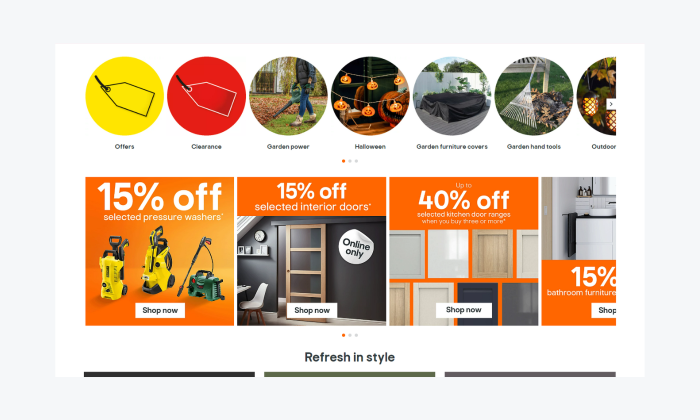
- Clear navigation—the menu is categorized in a simple way for users
- Accessibility—a website that is easy to access and navigate for people with visual, motor, auditory, and cognitive impairments
- Well designed customer journey map—users can easily navigate through every stage of their shopping experience, with minimal friction and clear guidance at each step
- Mobile-friendliness—shopping experience on mobile devices is smooth and enjoyable
- Copywriting—the site has compelling content that simplifies the user experience
Read more: Find out how Integrac boosted lead generation by improving user experience on the website using Tidio.
Now—how to improve user experience on an ecommerce website?
Ecommerce user experience best practices
With the right ecommerce UX design, ecommerce customers can find what they need, add it to their cart, and complete the purchases without any hassle or distractions. So, let’s explore how to make your online business successful by looking at some proven best practices used by leading brands.
1. Simplify the navigation
First impressions matter for ecommerce businesses! Users take microseconds to conclude whether a site has what they need or not.
In fact, customers make their purchase decisions in an average of 10 seconds, so retailers need to make the web design and product listings flawless. On top of that, keep in mind that site navigation and user experience often define the customer journey during online shopping.
So, how to improve your navigation? Here are a few things to consider:
- Clear and intuitive menus—use straightforward navigation links grouped in key categories with dropdown menus and breadcrumb trails that help users track locations
- Search functionality—implement a search bar with auto-suggestions and filters to help customers find products faster
- Add “load more” links—avoid splitting content into multiple pages (pagination) or loading new content (endless scrolling), rather opt for “load more” buttons
- Implement clear CTAs—make the CTA text short, easy to read, with action verbs where applicable, and position it where it’s always visible
- Show bestsellers—having a bestseller icon is a powerful form of social proof that can reassure uncertain buyers
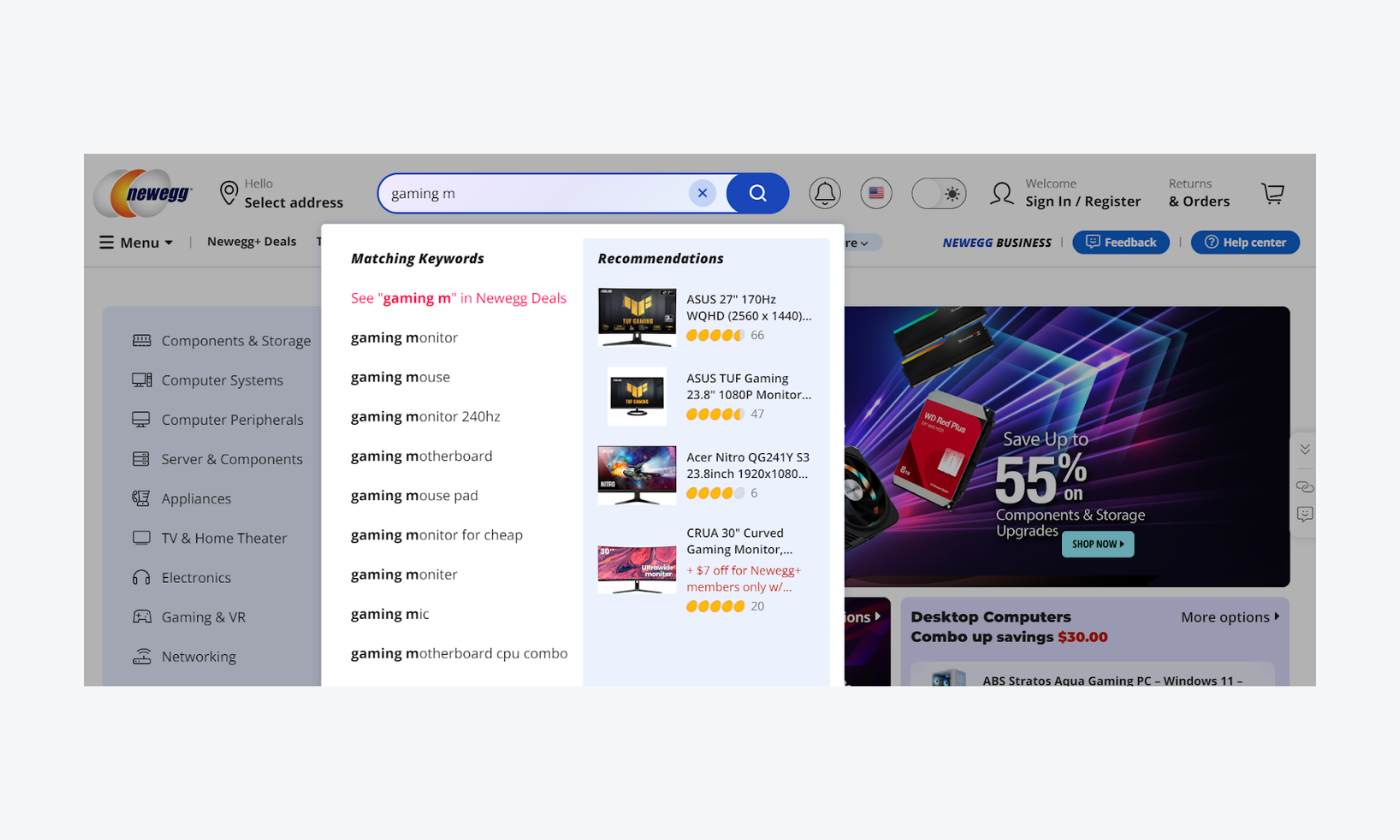
A great example of these UX ecommerce best practices used well is Newegg. The company has a visible search bar at the top of the page. Additionally, when you start typing, keyword auto-suggestions pop up to enhance the accuracy of your selection.
Did you know that…
According to research, about 69% of shoppers go straight to the search bar when they visit an ecommerce site.
2. Optimize for mobile
Smartphones are a huge source of ecommerce traffic, with some studies placing the figure at 78%. Surprisingly, many ecommerce sites online are yet to make their sites responsive to mobile. But you can use this disadvantage against them and differentiate yourself from the competition.
Here are some practical steps you can adopt to improve your site user experience and convert one-time shoppers into loyal customers.
- Responsive design—have mobile-tailored support gestures such as pinching, double taps, and more
- Mobile-first checkout—make the checkout faster by integrating mobile payment wallets, Apple Pay, Google Pay, PayPal, etc.
- Synchronization—actions performed on the phone should be synchronized across the board on every account
- Sticky navigation bars—set up a fixed navigation bar and have clear menu navigation labels for mobile devices
- Click-to-scroll navigation buttons—utilize anchor links when creating scrolling buttons for specific sections
- Mobile-tailored pop-up buttons—have pop-ups appear with large buttons
Here’s a real-life example of mobile ecommerce UX best practices put into great use:
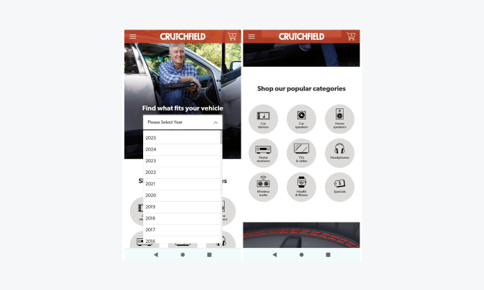
Crutchfield has a highly responsive mobile design that bundles popular product categories with clickable icons. If shoppers are looking for a specific item, they can narrow down their search to certain keywords from a dropdown menu.
Did you know that…
About 9 in 10 (91%) smartphone users between ages 18 to 49 use their devices to make online purchases.
3. Improve page load speed
It takes mere seconds to lose the undivided attention of online shoppers. And since about 82% of B2B sites load in 5 seconds or less, it’s crucial for your website to be quick, ideally between 0-4 seconds, in order for you to compete in the market.
To optimize your site’s load times:
- Compress images and files—optimize your site’s loading speed and SEO by compressing images, using lazy loading, and resizing images
- Content Delivery Network (CDN)—use responsive design, prefetching, and HTTP/2 to enhance website performance and efficiency
- Browser caching—implement caching to store parts of your website on the user’s browser to enable faster load times by avoiding the need to reload everything from scratch
- Test—use Google PageSpeed Insights to check your website’s performance
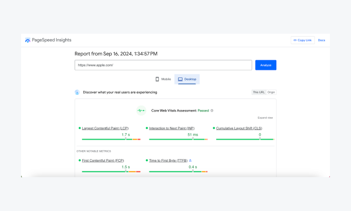
Apple’s website performance is an example of a screen you’d like to see when testing your site with Google PageSpeed. The key metric, Largest Contentful Paint (LCP), measures the time to render the main content. A good score is indicated with green, orange means your website needs improvement, and red shows poor performance. This website scores well on mobile as well as desktop.
Read more: Learn how to increase online sales for your ecommerce store.
4. Streamline the checkout process
Digital shopping only counts when a customer completes checkout. And since shopping cart abandonment rates are a serious issue for merchants, every purchase matters. And if your abandonment rates are high, it’s time to take a closer look at your checkout process to find potential issues.
Here are a few ways you can smoothen the final step to ensure the sale is actualized:
- Guest checkout option—offer a guest checkout to reduce friction for first-time users who don’t want to create an account
- One-page checkout—minimize the number of steps required to complete a purchase by consolidating the checkout process into a single page
- Express checkout option—allow customers to complete a purchase in a single click
- Checkout progress tracker—when a user clicks on “add to cart”, give them progress indicators so they know that the end is in sight
- Multiple payment options—on top of the usual credit card options, integrate Apple and Google Pay, and explore alternative “buy now, pay later” (BNPL) models like Klarna or Paypal Credit
- Product and service customizations—allow for the personalization of products and services to increase engagement
- Sales and retargeting campaigns—run campaigns to re-engage potential customers and increase conversion rates
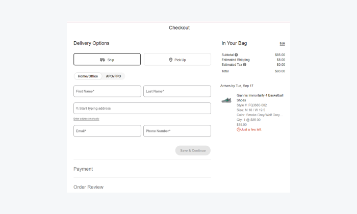
Nike is a great example of this tip being put into practice. This brand has a friction-free checkout page style. Details on prices are transparent including a breaking of what constitutes shipping and you can order a product without opening an account.
Did you know that…
Around 69% of online shoppers abandon their shopping carts, often due to a complicated or time-consuming checkout process. Simplifying this process significantly reduces instances of cart abandonment.
Read more: You can minimize your cart abandonment rate by implementing AI-driven B2B ecommerce tools.
5. Use high-quality product images and videos
Never forget the key advantage of an ecommerce store—convenience. While many customers would prefer to visit a physical store to see and try products before buying, that’s not always an option.
To bridge this gap, use high-quality images and videos to build trust and ensure what they see online matches the real product. This is crucial, as surveys show that strong visuals are a key factor in creating a satisfying shopping experience.
To do that, you can:
- Use multiple angles and illustrations—provide high-resolution images from multiple angles, zoom functionality, and videos to give users a better understanding of the product
- Add lifestyle images—include images that show the product in use to help customers visualize how it fits into their lives
- Utilize white backgrounds—have neutral backgrounds on your products to minimize distractions but let the product colors stand out
On top of that, ensure the right image sizes:
- for Shopify, the recommended image size is 1024×1024 (supporting up to 2048×2048)
- for Wix, a 200×200 image gallery format can produce a 400×400 product page
- for LightSpeed, a 512×512 image size is recommended as they are automatically reduced
Reformation is an example of a brand that has high-quality images that show products in great detail. On this website, you can zoom into great detail by hovering the cursor. On top of that, products can be sorted according to the newest, best of, pricing, and other categories.

Read more: Check out the best ecommerce help desk platforms available on the market.
6. Implement user reviews and ratings
The costs arising from a lack of trust in an ecommerce site is unsustainable. But, having user reviews and ratings implemented into your design helps to lower the worries and improve your site’s trustworthiness. Below are some actions leading ecommerce sites have implemented:
- Encourage reviews—allow customers to leave reviews and ratings on products, and highlight these on product pages to build trust
- Respond to reviews—engage with customers and show that you value feedback by responding to positive and negative reviews
- Integrate review management software—integrate third-party services like Trustpilot or use the built-in review features available on platforms like Adobe Commerce (formerly Magento), WooCommerce, and Shopify
- Offer discount codes and coupons—give special incentives to customers who write reviews
- Customer experience testimonials—collect written reviews, video testimonials, case studies, and influencer endorsements to build trust and credibility
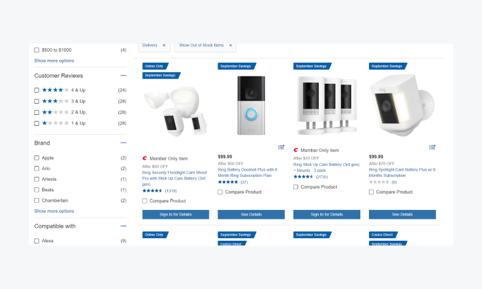
Costco highlights products with 5-star ratings to build trust and increase conversions. Reviews are quite detailed to help customers make informed decisions.
Did you know that…
According to Baymard UX, 64% of sites run algorithms that rate products in a manner that is not considered credible. This is a perfect opportunity for you to distinguish your site from the competitors.
7. Personalize the user experience
With the limited attention spans of users online, a personalized experience is very important in getting the right recommendations in front of customers. And by customizing the shopping experience to the buyer, businesses can increase the likelihood of conversion, cross-selling, and up-selling.
Let’s examine some approaches:
- Product recommendations—use AI product recommendation chatbot to provide personalized suggestions based on user behavior and purchase history
- Tailored content—offer personalized content, such as banners, emails, and offers, based on user preferences and browsing patterns
- Informative descriptions—include written product descriptions or video clips that capture product details that cannot be communicated through visual imagery
- Suggestions—give customers purchase suggestions drawing from their shopping preferences, previously searched content, and past transactions
- Offer a wishlist—provide shoppers with a wishlist feature, allowing them to save items and make the final purchase at their convenience
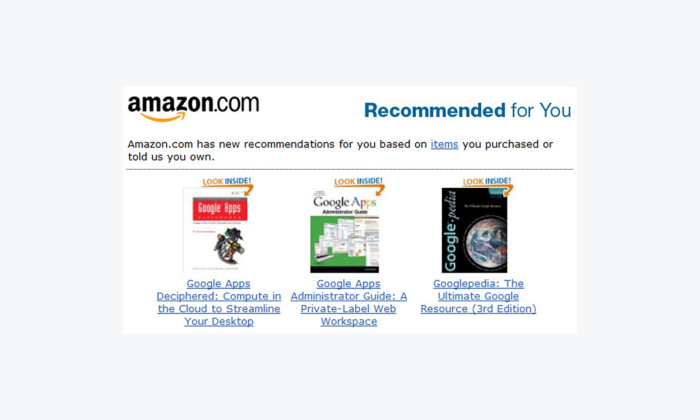
As an example, Amazon provides a highly personalized experience for users buying from the platform. It gives accurate product recommendation according to user searches and interests.
Did you know that…
About 74% of users bounce away from websites that don’t display content personalized to their interests.
8. Enhance product descriptions
Product descriptions are simply the answer to the “What are you selling?” question. It’s important to ensure the information there is accurate, presents the product well, and is easy to understand. When properly done, this can boost your store’s conversion rate and make the products appear more valuable to the user.
The best product descriptions include:
- Detailed and clear descriptions—write comprehensive product descriptions that include key features, benefits, and technical specifications
- SEO-optimized content—ensure that descriptions are SEO-friendly by incorporating relevant keywords naturally
- Product videos—show your products using individual videos that provide context on size and shape
- Size guides—add information on size to help customers get a size that fits well instead of ordering multiple items and having to return
- Return policy information—explain your return policy clearly
- Shipping costs—display shipping costs on the product information page to give customers an immediate understanding of the total cost
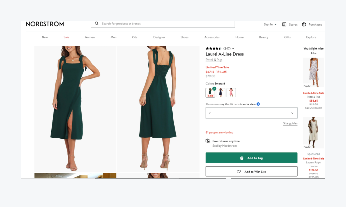
Nordstrom is a good example of a website with a great product description. This brand offers a size guide in the product description section that helps users to select the right dress size before making an order.
Read more: Learn what ecommerce automation is and how to use it for your business.
9. Simplify and clarify your returns policy
Your ecommerce store should have a clear return policy to give customers confidence in your products. This policy includes the return period window, the procedures of the return, duration for the refund, and any costs associated with the process.
Here are a few tips for creating a clear one:
- Ensure the policy is easy to find—put the ecommerce return policy in a visible place on your website and make it easy to understand
- Make the returns hassle-free—offer a simple and hassle-free returns process, which can help to increase customer confidence and reduce purchase hesitation
- Automate your returns’ management—integrate a software to help you manage the returns
- Offer direct exchanges—enable customers to exchange products as an alternative to a refund
- Act on returns data insights—using data from returns automation tools, address the most common issues likely to result in returns occurring.
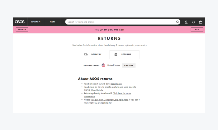
Here’s an example of an easy-to-understand returns page of an ecommerce giant, ASOS. They offer a brief bullet list outlining key shipping details and include a downloadable link for the full return policy.
Did you know that…
A study shows that 18% of customers abandoned a cart when they found the returns policy unsatisfactory. And over 63% of online shoppers are more likely to buy from an ecommerce store with free return policies.
10. Implement trust signals
Given the numerous risks consumers face online, people are increasingly cautious about who they do business with. This disadvantages small ecommerce stores that have yet to build brand recognition. So, if your goal is to convert visitors, it’s worth developing customer trust.
Here are some trust signals that build credibility online.
- Security badges—to reassure customers, display security badges, such as SSL certification
- Trustworthy payment options—offer multiple secure payment methods, including well-known providers like PayPal
- Unique selling points (USPs)—showcase the product’s unique selling point in front of the visitors
- Guarantees, security notices & policies—give customers risk-free purchase options
- Social proof—integrate third party rating platforms and plugins like Reviews.io, Trustpilot, Google Reviews, or Judge.me
Goodfair is a good example of this tip for ecommerce UX. This store offers a money-back guarantee on all the products to relieve some of the stress from the customers. On top of that, the ecommerce site let’s shoppers pay in installments using shopPay and provides a number of payment options including the trusted PayPal and Google Pay.
Did you know that…
Trust is a big factor online—particularly in ecommerce. Especially as 1 in 3 Gen Z consider online stores to be untrustworthy.
Read more: Learn how security matters are handled at Tidio.
Best practices for ecommerce UX: key takeaways
Adhering your online store’s user experience is essential for driving conversions and enhancing customer satisfaction.
Here are the most effective ecommerce UX best practices:
- Simplify the navigation
- Optimize for mobile
- Improve page load speed
- Streamline the checkout process
- Use high-quality product images and videos
- Implement user reviews and ratings
- Personalize the user experience
- Enhance product descriptions
- Simplify and clarify returns policy
- Implement trust signals
Bottom line—
You need a user-friendly website design starting from your homepage, through the landing pages, and all the way to the “Thank you for your order” page. This will help you succeed in the world of ecommerce.
FAQs
User experience (UX) is simply how enjoyable a customer finds their experience interacting with an ecommerce website.
Among some of the best practices are:
– Simplify the navigation
– Optimize for mobile
– Improve page loading speed
– Streamlining the checkout process
– Use of high-quality product images
– Implement user reviews and ratings
– Personalize the user experience
– Enhance product descriptions
– Simplify and clarify your returns policy
– Implement trust signals
User interface (UI) and user experience (UX) are what determine whether users are satisfied with their interaction with your site. A positive and frictionless experience improves conversions and builds customer loyalty for return purchases.
The key rules for a good user experience are:
– Focuses on users
– Delivers on consistently
– Creates a usable product
– Generates a visual hierarchy
– Gives users control
– Designed for accessibility
You can improve your UX workflow is by:
– Consistently researching and collecting data on users
– Creating detailed user personas to help you craft compelling UX
– Using tools like Figma, Sketch, or Adobe XD to create wireframes and prototypes
– Conducting usability tests with real users to point out issues and collect feedback
– Creating collaboration between developers, designers, and stakeholders
– Running iterative designs and continuously improve guided by user feedback
– Being dynamic while maintaining brand consistency

