According to Insider Intelligence, over 2.6 billion shoppers nowadays buy products online. This massive number indicates the importance of an ecommerce website for growing your business effectively.
Now—
What is the best way to create an online store that helps to reach your target audience and expand your brand?
First of all, you need to know what elements to include in your site, what designs work best, and which platform to use.
So, let’s go through the step-by-step guide that will allow you to have a successful start.
Learn how to recreate in-store experiences on your ecommerce website
Let’s start with a quick explanation—
What is an ecommerce website?
To put it simply, an ecommerce website is a type of site you can use to sell products and services online. It’s a digital version of a physical store that allows you to present goods using dedicated product pages and categories. Your customers can purchase items by adding them to the shopping cart and completing their purchase using their credit card or services like PayPal.
Any site where you can sell products or services can be considered an ecommerce website. As such, it can represent a small business, a large retailer, or a marketplace.
Looking at ecommerce statistics, it’s easy to see just how beneficial having an online store can be for your business—both now and in the future.
Worldwide ecommerce sales are expected to increase by over 10% in the year 2023 alone, with steady growth present each year. By 2026, it’s forecasted that 24% of retail purchases will take place online. And it’s estimated that by 2040, 95% of all purchases will be done using ecommerce!
Now, let’s dive even deeper—
Key ecommerce website design elements
When planning to design an ecommerce website, you need to think of the elements your site will consist of.
What you include in your online store can heavily depend on the type of industry you’re in, the products you plan to sell, and your shoppers’ specific needs. Still, there are some vital elements any online shop can benefit from having, be it big or small.
The five key elements are:
1. Homepage
Think of a homepage as the digital storefront of your ecommerce site. A well-designed homepage should be able to entice a customer into not only checking out what you have to offer, but also motivate them to complete an online purchase. That’s because it’s often the starting point of a customer journey.
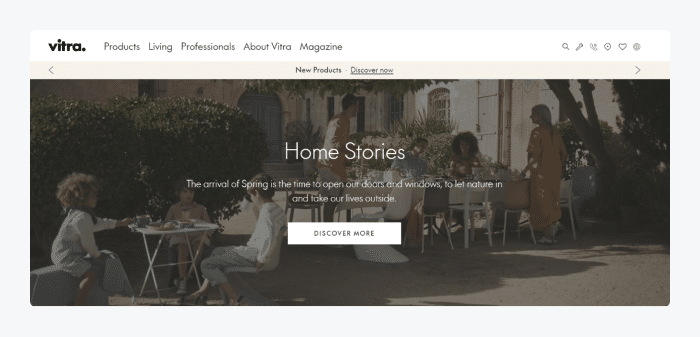
Taking all this into account, it’s crucial to add elements to your homepage to make it quick and easy for customers to find what they need. This includes user-friendly navigation, pop-ups, and live chat functionality with product recommendations or special offers. Also, it’s a perfect opportunity to add beautiful images of your items that lead to your main product categories.
Read more: Check out detailed reviews of the top ecommerce live chat solutions with pros, cons, and pricing comparison.
2. About us
As its name suggests, the main purpose of an About us page is to let a potential customer get more familiar with your business and learn what it’s about. It’s a perfect opportunity to emphasize the quality of your products and concisely explain your shop’s vision.
In fact, studies show that for 52% of customers, an About page is the first thing they expect to find when landing on a website.
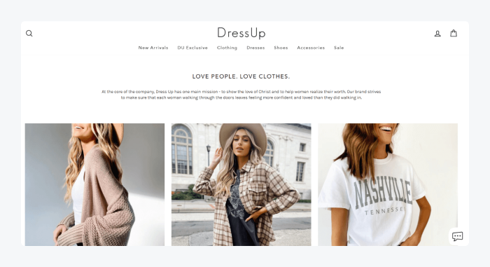
You can use this page to mention your history, introduce your team, present your vision and mission, share goals, and write a little about your values. All of these will allow you to showcase your unique brand identity and professionalism when it comes to selling products.
So, the About us page is usually all about telling your story and introducing your brand. When it comes to design elements, it can also contain attractive visuals of your products, timeline elements, and captivating sliders.
3. Category pages
This page is easily one of the most important pages on your site, as it can do wonders for the user experience of your customers.
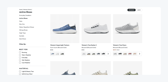
Essentially, category pages allow you to arrange and display your products in a logical manner. Their main purpose is to allow customers to quickly find what they need while motivating them to complete a purchase at the same time.
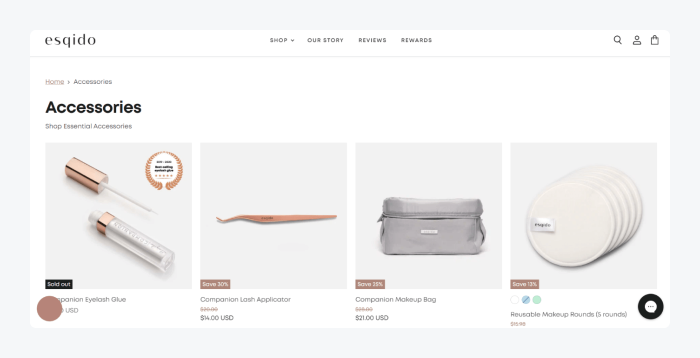
To ensure that your category pages are more user- and SEO-friendly, you can add short but accurate product descriptions. These include product filters and search functionality for even quicker access to the right items.
Read more: Check out the effective ecommerce UX best practices to boost your online store’s results.
4. Product pages
It’s safe to say that product pages are the essential elements of any online store. When done well, they can help your products shine and sell better. This is where you should add product specifications, including main features, design, colors, materials, etc.
Of course, this also means you should include high-quality images of your product to help showcase its value. To do this, you can include a zoom-in feature for a better view, add images that show your product from different angles, include color swatches, and more.
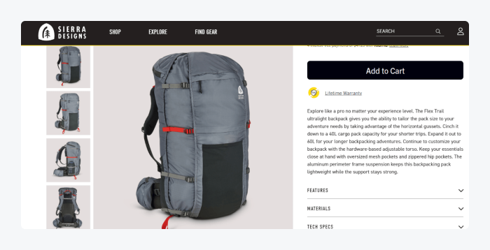
Product page is also the ideal place to include ratings and reviews of your item for much-needed social proof. In addition, this kind of page can often provide a cross-selling opportunity by allowing you to display related products from the same category.
5. Checkout page
It’s safe to say that an ecommerce site without a checkout page is like a car without an engine. This type of page is essential as it provides your customers with an easy and smooth way to make a purchase.
In fact, statistics indicate that not having a user-friendly checkout on your site can be one of the key reasons for shopping cart abandonment.
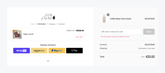
There are many different elements you can add to your checkout page. These include shipping information, sales tax details, and accurate pricing breakdown. You should also offer guest checkout for visitors who don’t want to create an account to make a purchase. You can also add a number of payment methods they can use.
But remember—to increase your store’s conversion rate and reduce abandoned carts, you need to ensure that the checkout is designed in a simple and user-friendly manner.
Read more: Here’s the ultimate checklist for starting an ecommerce business.
How to build an ecommerce website: key steps
Now you know the most important elements and pages you can find on an ecommerce website. So, it’s time to talk about steps you should take to build one yourself.
- Pick an ecommerce platform
- Choose your domain
- Pick an ecommerce template
- Add your products
- Set up payment options
- Provide shipping info
Here’s what you should do to build your online store from scratch and capture the attention of the right clients:
1. Choose your ideal ecommerce platform
First things first—
Before deciding on the design of your online store, you need to choose an ecommerce platform to build your site on.
Now, it’s important to note that there are different types of platforms you can use to create your online store:
- Open-source
- SaaS (software-as-a-service)
- On-premises
Open-source platforms like WordPress allow you to create a website freely using the provider’s source code. They’re easily customizable and free to use. However, you’d still need to get a hosting provider to ensure the security of your site. So if you opt for this platform type, you should expect some additional costs.
SaaS or software-as-a-service platforms are a great choice as they are specifically built for ecommerce stores. They’re secure, scalable, and have all the features for a start-up business. That being said, you should expect a monthly subscription fee and transaction fees on each purchase. Shopify is a typical example of a software-as-a-service platform.
Finally, on-premises platforms are ideal for businesses that want to have control over every aspect of their online store. This includes the way their platform looks, processing of data, handling security, and updating the software.
These platforms are hosted locally and managed directly by the store owner instead of having someone else do it via the cloud. So, the potential cost is much higher as you would have to take care of everything yourself—from supplying salaries to your employees to maintenance and security-related costs. Adobe Commerce (formerly Magento) platform is a perfect example.
Bottom line—
The type of platform you go for depends entirely on the type of ecommerce business you own and your budget.
Read more: Learn all you need to know about the must-have ecommerce integrations you can use to maintain your business online.
2. Pick a domain name
The name of your brand is usually the first thing people see when getting familiar with your business. So, you want to make sure that your domain name matches the one of your brand so that people can easily associate it with what you have to offer. For example, if the name of your business is Leather Jackets, your domain name should be a variant of leatherjackets.com.
And speaking of .com—
You should also be careful when choosing your domain extensions, like .com and .org. While there are tons of extensions to pick from, .com and .net are among the most commonly used ones. Namely, the .com extension is typically used for more general commercial purposes, while .org is widely used by non-profit organizations. Also, businesses with .net extension often fall into the network service, database, and technology categories.
However, there are many reasons to go beyond those categories. For example, you can get a .life domain. You’ll want to do that if you own a wellness or health business. These specific domains can build your credibility in your niche.
In short, your domain extension can also be another indicator of what your online business is about. So you should match it to fit your brand type and purpose.
And if you’re struggling to pick a perfect name for your ecommerce business, here are a few key points to consider:
- Make sure it’s easy to remember
You want people to spread the word about your brand. The easiest way to do so is to make your name memorable and easy to pronounce. So, simplicity is key here. You want to stay away from adding things like numbers, hyphens, or any other signs or characters that would make it too complicated for people to spell.
- Keep the name short and concise
In a way, this is connected to the first point. The shorter your name is, the easier it will be to remember. If possible, try to make it between 6 and 13 characters in length.
- Choose a unique name
By doing so, you have a chance to stand out from the competitors. Unique names are more brandable and easier to memorize. Plus, you won’t have to worry about running into a copyright issue by accident.
And if you have trouble with inspiration, you can always try using the help of a domain name generator, like Nameboy.
With that out of the way, let’s move on to the next step—
3. Choose an ideal ecommerce theme
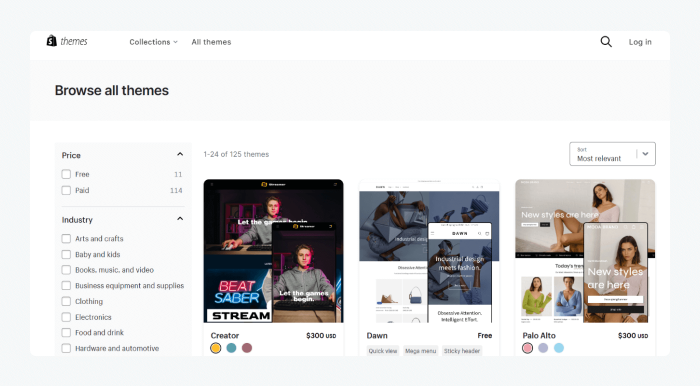
Otherwise known as templates, themes usually consist of ready-made pages and other site elements that help to build your online store quickly and with ease. What’s great is that they can be used by complete beginners since they require no coding knowledge.
Plus, these templates are usually packed with plenty of customization options allowing you to change the styling or design of certain page elements. These include header and footer, site navigation, etc.
Many popular ecommerce platforms include a library of free and premium themes suitable for any shopping category imaginable. These include anything from furniture and clothing to jewelry and custom arts and crafts categories.
Here are a few things to consider when choosing your perfect ecommerce template:
- It has user-friendly navigation
This should go without saying, but smooth navigation is key to providing an excellent customer experience. If your site visitor can’t quickly find what they need, they will most likely abandon your site and choose to buy from a competitor instead.
So, make sure your theme supports navigation that is simple and easy to find but still makes it possible to access your most important pages, like key product categories. That way, your customers will never be more than a few clicks away from any product you’re offering.
- It matches your brand identity
A template you choose should be able to reflect your brand at the first glance. So, you should keep this in mind during your selection and check whether your template’s homepage fits your brand vision.
You can ask questions like, are the pages customizable enough to fit your brand’s color scheme, fonts, and other elements? Does the template allow you to display products in multiple ways, or is there only one way to do it?
- You can easily add third-party apps and integrations
Many templates come with built-in features necessary to get your store up and running in no time. They even include the ability to embed your social media, offer different payment methods, provide a number of shipping options, etc. And in case these are not included with the template, you should check whether there are apps you can easily integrate into your theme to enhance your ecommerce website features and functionalities.
Read more: Explore some of the best WordPress ecommerce themes available on the market.
4. Add your products
When adding products you plan to sell, display them in a way that enhances their quality and value. But not only that—you should also make sure they’re easy to find and get them to attract customers to make a purchase.
Here are some of the key things to consider when displaying products in your store:
- Optimize product descriptions
These are crucial components of any ecommerce site. You can use descriptions to make the most of your product pages and get your items to shine. For example, you can describe essential details like the materials, colors, and dimensions. You can also explain what the item can be used for and highlight different ways in which it can be helpful for your customer.
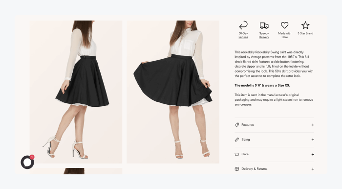
And while this is a perfect place to describe your product at length, you should still avoid going for too complicated descriptions and extravagant phrases. For example, if you’re selling running shoes, simply explain how practical and comfortable they are instead of writing an entire novel about them.
A golden rule is to keep things concise and straight to the point while still informing customers about your goods.
Read more: Learn all about product marketing and find out how to plan an effective strategy for your products.
- Add quality images.
It’s no secret that people can get easily attracted to visuals. Research indicates that it only takes 13 milliseconds for people to process images. And visuals are processed 60,000 times faster than text! So, the impact quality images can have when attracting customers cannot be stated enough. ou can use an image upscaling tool to improve the quality if necessary.
Apart from making sure the images accurately depict the value of your products, you should ensure that every image has a similar size for consistency and harmony. In addition, you should add multiple images of the same item to capture it from different angles and give customers a good idea of what it looks like. You can also include some images or videos of a product in use, as it can help resonate with customers better and make it sell more. For example, if you’re offering a handbag, featuring a photo of a person wearing it is always a good idea.
- Keep users in mind, no matter what
You should always think about user experience when presenting your products. So, apart from adding accurate descriptions and quality photos, make it easy for customers to find what they need. You can do this by including specific product categories in your navigation. Moreover, you can add filters according to brand type, color, material, size, price range, etc.
You can even use the help of a customer service tool like live chat software. This kind of system will help you send personalized messages to customers in a timely manner.
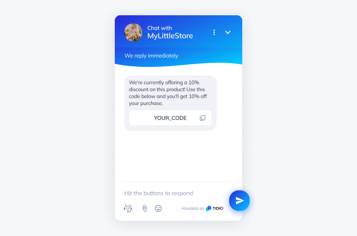
These can be welcome messages, similar item recommendations, special offers, and featured products. Your messages can also get sent automatically with the use of chatbots when users click on a specific item or enter a set product page.
Read more: Learn all about the best practices and tactics to use for your ecommerce growth strategy.
5. Set up payments
If you don’t provide your customers with appropriate payment methods, it would be downright impossible to sell anything on your online store.
Generally speaking, there are three types of payment gateways you can use to sell online: redirects, checkouts on-site/payments off-site, and on-site payments.
Redirects require a customer to go to a site outside your own to make payments. PayPal is a common and popular example. While this method is convenient as it frees store owners from worrying about security, it’s not always the ideal solution for customers as they need to leave your online store to complete a purchase. So, some people won’t like it, but there are still many that appreciate having this option.
Providing the checkout on-site with a payment off-site means the customer can start the payment process on your checkout page (i.e. by adding payment info). But the final and most crucial step will take place on the payment processor’s site. Stripe is one of the most popular payment gateways in this category.
Last but not least, on-site payments take place on your site—just as their name suggests. This is the most user-friendly option for your customers, but it does require you to take full responsibility when it comes to security.
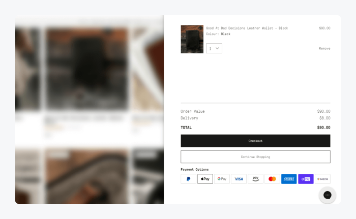
When picking the ideal payment gateway options for your ecommerce site, you need to check whether the gateway service you plan to use is compatible with your ecommerce platform.
Luckily, the most commonly used ecommerce platforms out there work well with the majority of popular payment processors. For example, an ecommerce platform like WooCommerce comes with a way to easily integrate with the likes of PayPal, Stripe, and Authorize.net, to name a few.
So, the general advice is to stick to the tried-and-true names. This will increase your website’s trustworthiness, provide your visitors with varied, secure payment options, and improve their shopping experience.
6. Set shipping options
Taking care of the shipping on your store should be one of the final, but no less important steps of creating your own ecommerce site.
First things first, you should create a shipping strategy. This will probably depend on several factors, like whether you’re shipping worldwide or just locally and if there are different fees you plan to include.
No matter what type of shipping policy you offer, just make sure all the relevant information is available and easy to find in your store. You can do this by adding a link to the shipping policy page in the footer or including relevant shipping info in your FAQs.
Also, you can include all the available shipping options in your product and/or checkout page to make things as transparent for your customers as possible. They will surely appreciate it.
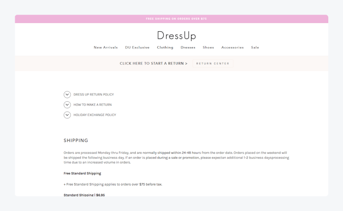
Once you think of a shipping system that works best for your business (and your customers), you should determine the shipping tools you want to use. There are great solutions out there that will allow you to streamline the entire shipping process. This includes the ability to easily manage orders and inventory, let users track their shipments, and much more.
Some of the most popular shipping tools you can easily integrate with most ecommerce platforms are:
Those were the key steps to creating a user-friendly ecommerce store that stands out from your competitors.
But wait—
How do you know which design to go for?
Let’s explore some ideas.
10 best examples of ecommerce websites
Okay—
It’s time to present you with ecommerce design examples you can use for inspiration.
Without further ado, here are some of the best ecommerce websites out there. For every example, we’ll highlight top web design elements that will be useful for you as a future business owner.
1. Ad Hoc Atelier
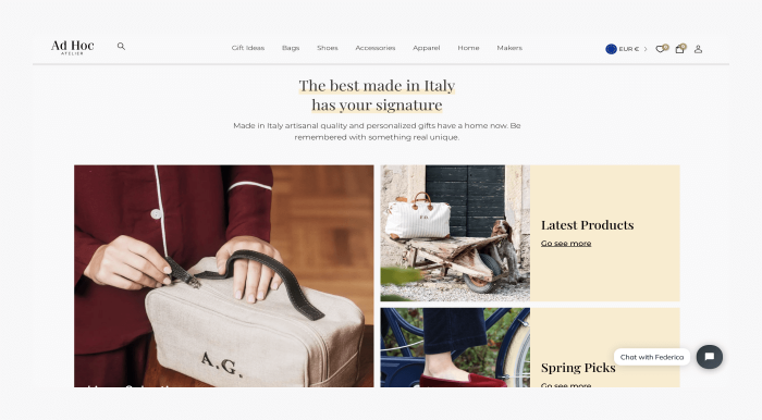
Ad Hoc Atelier is an Italian fashion ecommerce company that makes personalized communication with customers their priority. Their idea was to bring the best Italian artisan brands together and offer a chance of getting customized items.
Hovering over the main menu opens a mega menu with detailed categories, so customers can quickly find any products they need. Each product page comes with images that showcase an item from multiple angles.
You can also choose a product with your initials and pick the letters’ size, font, and color. For cross-selling opportunities, there is a group of similar products displayed at the bottom, as well as a People also browsed section.
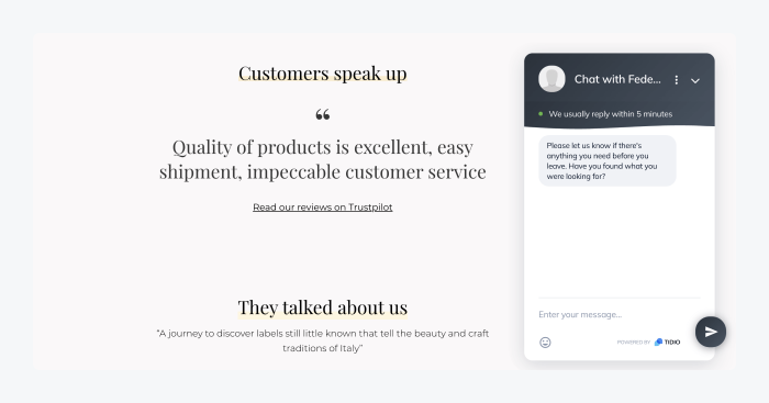
Moreover, the company uses a chat widget on product pages with a welcome message asking shoppers if they need any assistance. Using this proactive live chat tactic allowed them to interact with consumers in real time and increased their conversion rate.
Read more: Check out how eye-oo, a multibrand ecommerce store, increased their revenue with the help of AI-powered customer service.
Learn how to recreate in-store experiences on your ecommerce website
2. Marleylily
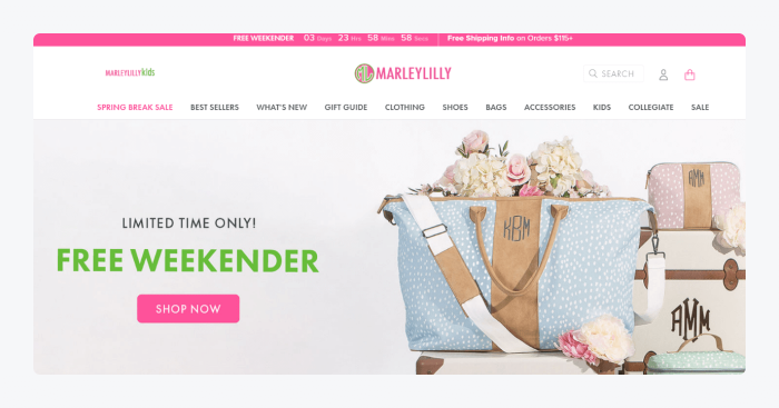
Marleylilly sells unique gifts, clothing, jewelry, and accessories. The product range is extensive, yet the presentation is orderly.
This store uses a unique and consistent color palette for promoting its products. The navigation menu offers both traditional and image-based categories. Moreover, there is also a search feature right at the top, further enhancing the user-friendliness of the entire site.
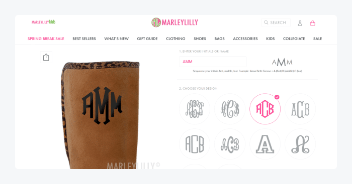
Another thing to note is the possibility of product customization. This ecommerce website sells monogrammed products, so customers can personalize their items with name initials, colors, and designs with a built-in product editor.
3. Ratio Coffee
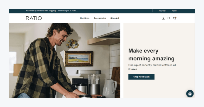
Ratio Coffee is a Portland-based brand that sells coffee machines. This ecommerce website uses a vibrant hero image to show one of the products in action. The home page delivers the value proposition—“Make every morning amazing”. This is also where they highlight their best-selling pieces using grid product images.
Moreover, the product pages include simple but informative descriptions of each item. There are elements such as ratings and reviews, color swatches, testimonials, and a list of recommended products for the cross-selling opportunity.
4. 511 Tactical
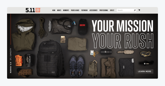
511 Tactical is a California-based provider of military and tactical clothing and gear, including anything from military t-shirts and tanks to outerwear and accessories. This is a perfect example of a custom-made Adobe Commerce store. It comes with a powerful product search engine that helps to find goods quickly regardless of their range. All a customer has to do is start typing in the search bar. No matter what page they were on, the website immediately switches into a “search engine” mode.
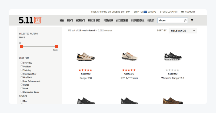
The results change in real time as you type, showing products that match the keywords. In addition, there’s a neat product filter menu on the left for even better results.
Read more: Find out the key differences between Adobe Commerce vs Shopify and learn which platform best fits your needs.
5. Fronks
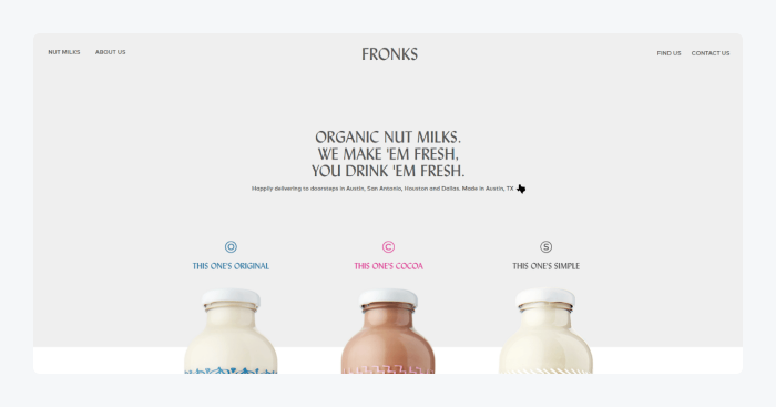
Fronks is a Texas-based seller of organic milk. This ecommerce website example delivers a unique experience using a minimalistic style. The home page has a clean and modern design that focuses on three items as these represent the entire product range.
Their product pages are designed in a super simple but effective manner. There’s an image of a bottle, a description, and a CTA, with a lot of white space to make the item stand out. Scrolling down makes the bottle change into another product type. This is an interactive way to show off your products on a single page.
6. The New Craftsmen
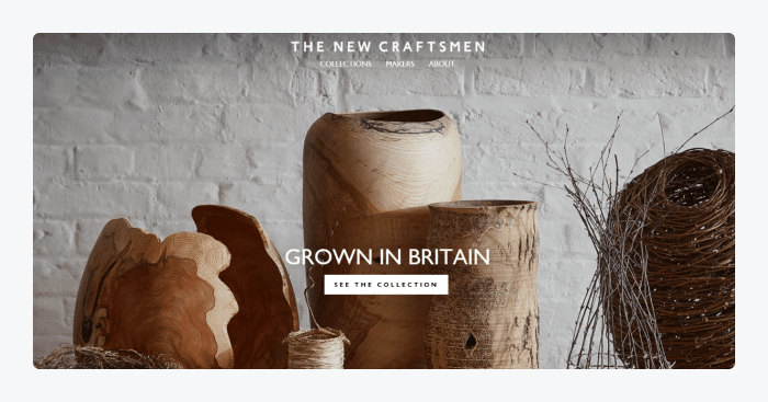
The New Craftsmen represent a large network of makers that create and sell jewelry, ceramics, textiles, and other materials. This ecommerce site efficiently accommodates hundreds of products, individual maker bios, collection pages, and more.
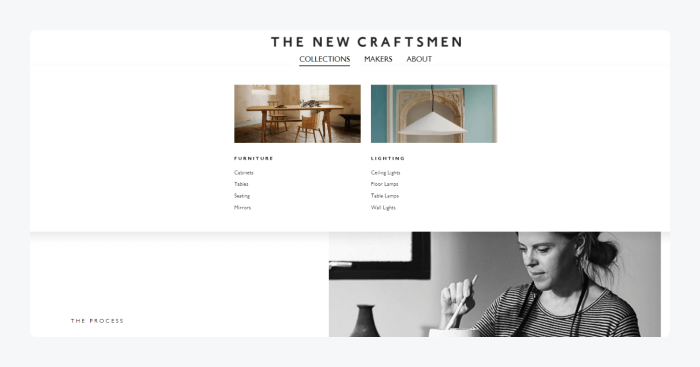
Despite having a huge number of pages, The New Craftsmen’s menu is small and navigation feels effortless. The overall design is also very elegant and artistic, which complements the site’s purpose. The About page accurately depicts their mission and allows you to learn more about their history and the makers themselves.
7. BloomScape
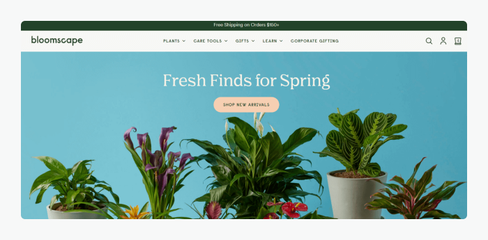
Bloomscape is a house plant seller from Detroit that uses WooCommerce to create a great shopping experience for customers. There are product search filters that help visitors find plants easier. These include filters according to size, pet-friendliness, light needs, color, price, etc.
The product pages contain detailed product descriptions, shipping details, testimonials, and the ability to change pot color. When adding products to cart, there’s a cross-selling opportunity with a suggestion to add similar items.
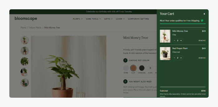
Other notable elements are a user-friendly menu and a powerful product search feature. Every product is categorized for the visitor’s convenience, along with good-looking preview pictures.
8. Crate & Barrel
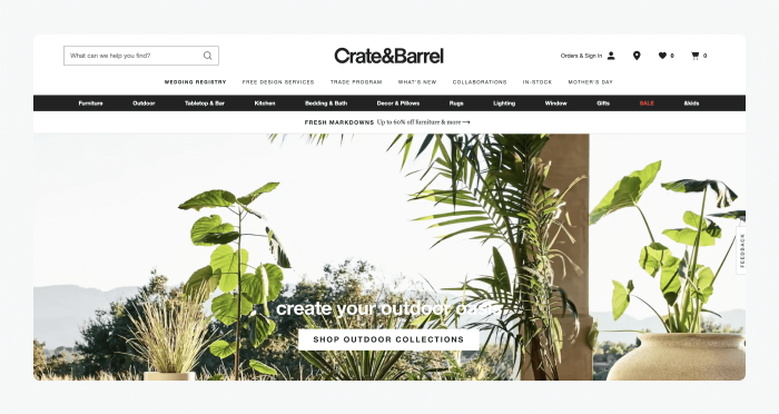
Crate & Barrel specializes in offering a wide range of home products, including outdoor furniture, home décor, and kitchen appliances. The homepage is adorned with beautiful pictures of their collection displayed in a fullscreen layout. What’s also noteworthy is the practical mega menu that displays detailed categories with featured pictures of the products.
Product pages offer detailed info, images of each item from many angles, as well as photos of products in use. The company also utilizes a live chat widget to communicate with customers.
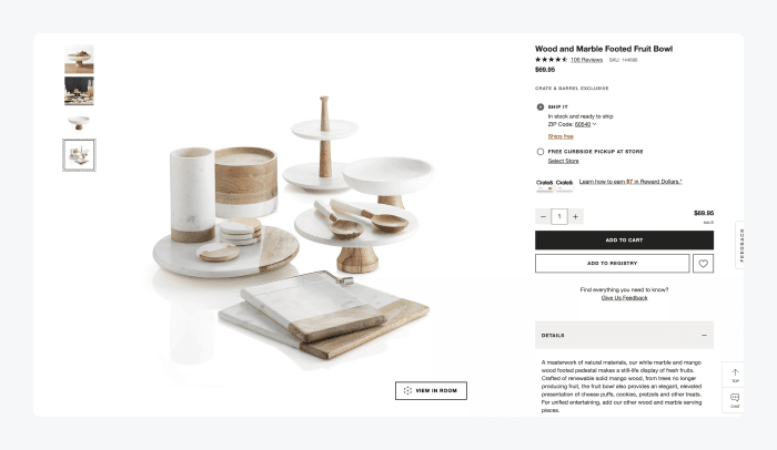
Despite having a lot of details, each page features a clean and sophisticated design with plenty of white space as a contrast.
9. Flyers Cocktail
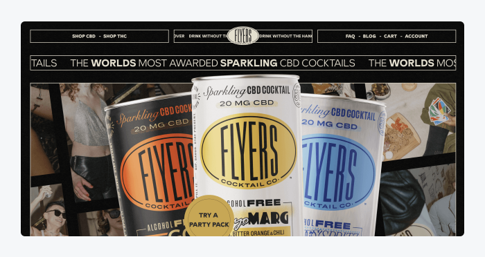
DrinkFlyers is an online store that sells cocktails. What captures the attention as soon as you enter their site is an intro section with the question, “Are you 18 or over?” and two witty options for replies, “Hell yeah!” and “No, I wish!” As soon as you confirm you are over 18, the homepage displays the main three products.
The site captivates the visitor with its unique retro style and moving text. It also has interactive CTA buttons that move along with the mouse and appear once the cursor hovers over the items. These are sure to add to the user’s experience on the website.
11. Allbirds
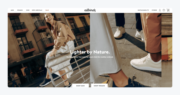
Allbirds is a clothing and shoes store that sells items online for men, women, and kids alike. There are pictures of featured products and items on sale displayed across the homepage, allowing a visitor to quickly find the best offers.
The menu is simple and straightforward at first glance. However, once it’s clicked on, it opens a detailed mega menu that allows you to explore product categories and find everything you need with ease.
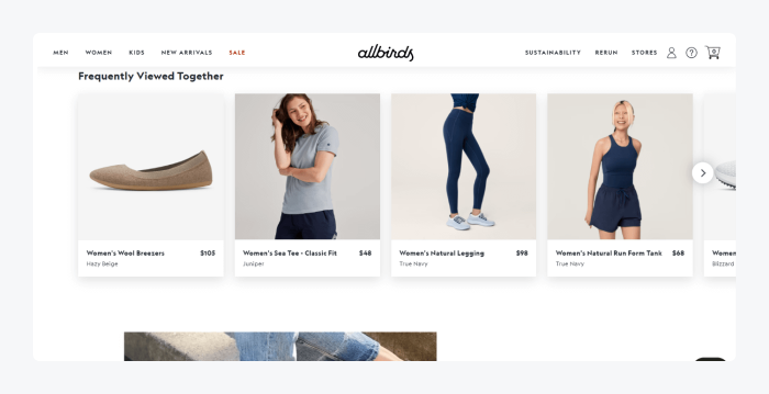
The product pages are fairly detailed, coming with zoomed-in pictures and animations, core features, shipping details, returns info, and reviews. There is also a slider that lists products that are frequently viewed together for a cross-selling opportunity.
And that completes the list of cool ecommerce websites. Hopefully, some of these examples inspire you while creating your own!
5 best ecommerce website platforms
So, now you’re familiar with some great examples of ecommerce website design.
But how do you find a platform that will help you create an outstanding online store for your own needs?
The following ecommerce website platforms come with some great site-building features. These include a drag-and-drop functionality, multiple templates, and other functionalities to help you maintain your sales, orders, and inventory.
Before we review each platform in-depth, here’s a comparison table for a quick look:
| Ecommerce website platform | Rating | Free plan/trial | Best for |
| Shopify | 4.5/5 ⭐️ (5,980+ reviews) | 3-day trial available | Small/medium-sized businesses |
| BigCommerce | 4.4/5 ⭐️ (280+ reviews) | 15-day trial available | Medium-sized businesses and retail |
| WooCommerce | 4.6/5 ⭐️ (790+ reviews) | ✅ | All kinds of businesses and retailers |
| Adobe Commerce | 4.0/5 ⭐️ (480+ reviews) | ❌ | Medium-sized businesses, large brands, enterprises, and marketplaces |
| Wix | 4.4/5 ⭐️ (9,200+ reviews) | 14-day trial available | Beginners and small businesses |
Now, let’s explore them in even more detail with pros, cons, and pricing each tool can bring to your ecommerce business.
1. Shopify

Rating: 4.5/5 ⭐️ (5,980+ reviews)
Shopify is a user-friendly ecommerce platform ideal for small and medium-sized businesses. All you have to do is sign up, pick your preferred domain, choose a theme, add products, set prices, and you’re ready to go. Shopify takes care of all the technical aspects, so you can simply focus on starting your online business and making sales.
Pros:
- Discounts and gift cards
- The ability to manage orders, inventory, and collections
- Cataloging and categorization options
- Online payment protection
- Drag-and-drop builder & templates
Cons:
- Transaction fees for third-party payment gateways
- The Storefront API returns errors from time to time
- 3-day free trial available
- Starter ($1/mo for three months)
- Basic ($39/mo)
- Shopify ($105/mo)
- Advanced ($399/mo)
- Shopify Plus (starts at $2,000/mo)
- Commerce components (contact sales)
Read more: Find out all there is to know about current Shopify pricing plans and fees. In addition, check out the best ways to install Tidio on your Shopify store.
2. BigCommerce
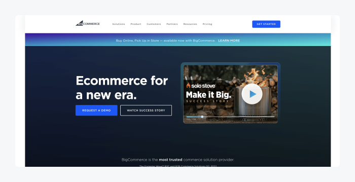
Rating: 4.4/5⭐️ (280+ reviews)
BigCommerce is an ecommerce website builder with an excellent reputation. It works best for medium-sized businesses and retail brands. There’s a wide variety of features that come with the platform, so you won’t need to add too many third-party integrations.
Pros:
- Fast website loading speed
- Technical SEO optimization
- Drag-and-drop page editor for custom designs
- Customer incentives (discounts, etc.)
- Integration with 65 payment processors with no fees
Cons:
- Some users think the platform is overpriced
- Free themes are very limited
- 15-day free trial available
- Standard ($29/mo)
- Plus ($79/mo)
- Pro ($299/mo)
- Enterprise (contact sales)
Read more: Check out the best apps for BigCommerce and how to find the right ones for your store. Also, check out the key differences between BigCommerce and Shopify.
3. WooCommerce
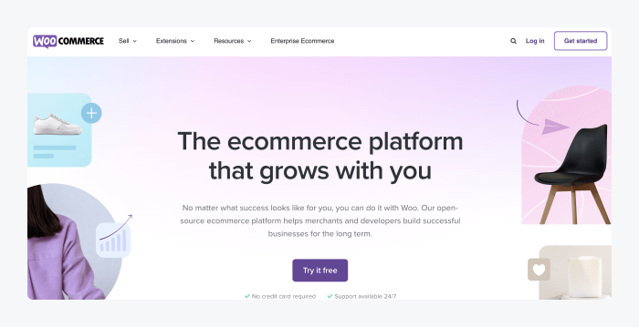
Rating: 4.6/5⭐️ (790+ reviews)
WooCommerce is one of the best free WordPress ecommerce plugins available. If WordPress is your platform of choice, then WooCommerce is practically “the default” option. Small businesses prefer it because of its low starting costs. Besides, you can customize literally every aspect and get a unique ecommerce store in no time. On top of that, you get to manage anything from shipping and payments to coupons and inventory.
Pros:
- Easy to manage and customize
- Budget-friendly—the WooCommerce plugin is free
- Filtering options with parameters like pricing, popularity, etc.
- Tons of add-ons to help with sales, inventory, and social media
- The ability to sell on marketplaces like Amazon and eBay
Cons:
- Some free WooCommerce plugins might have security loopholes that can compromise your store
- Premium plugins and hosting require payments, so pricing can go high real fast if you aren’t careful
- Installing WooCommerce on WordPress is free, but there are additional costs for domain and hosting
Read more: Learn the differences between WooCommerce and Shopify and determine which one works better for your business. Also, check out the best WordPress chatbot plugins for your business.
4. Adobe Commerce
Rating: 4.0/5⭐️ (480+ reviews)
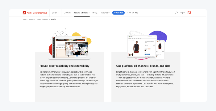
Adobe Commerce (formerly Magento) is a page builder that contains everything you need to run a successful online store. This includes custom integrations with third parties (suppliers, etc.) of your choice. On top of that, the platform lets you create a user- and mobile-friendly checkout experience for customers who use mobile devices. It’s also very adaptable for sellers in need of a complex solution.
Pros:
- Drag-and-drop web page builder
- Product recommendations
- AI-powered live search tool
- Inventory and order management
- Third-party shipping solutions
Cons:
- The tool is complex, so if you’re a beginner, adding features could be difficult
- To get the most out of the platform, you’ll need the help of a developer, which increases the total costs
- Adobe Commerce Pro (upon contact)
- Managed services (upon contact)
Read more: Discover the best Adobe Commerce live chat extensions you can use on your online store. Also, find out more about the differences between WooCommerce and Adobe Commerce to check which one meets your needs better.
5. Wix
Rating: 4.4/5⭐️ (9,200+ reviews)
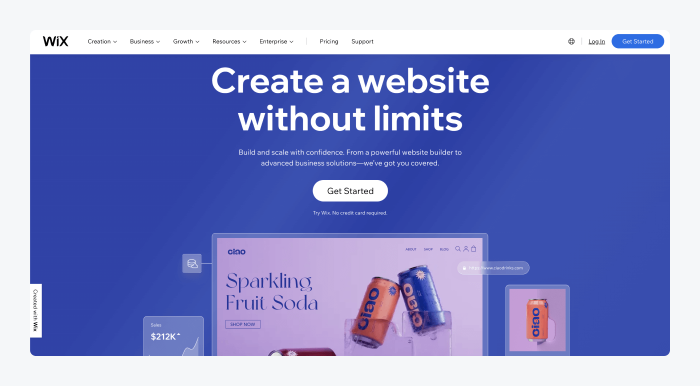
Wix is a great ecommerce website platform that is ideal for beginners. It’s built with SEO in mind and comes with a multichannel functionality. What’s also great about this platform is that it’s designed to offer top-notch performance and ensures fast loading times.
Pros:
- Over 500 customizable templates
- Easy inventory management
- Custom domain, logo, and other brand tools
- AI technology that helps build a website for you
- Website security fully managed by Wix experts
Cons:
- Limited functionality that can be extended to some degree with plugins
- Wix branding logo on your site can’t be removed when using a free plan
- 14-day trial available
- Connect Domain ($4.50/mo)
- Combo ($8.50/mo)
- Unlimited ($12.50/mo)
- VIP ($24.50/mo)
- Business Basic ($17/mo)
- Business Unlimited ($25/mo)
- Business VIP ($35/mo)
- Enterprise (request a call)
Read more: Should you go for Shopify or Wix? Learn which platform works best for your ecommerce needs. Also, be sure to check out the top live chat apps for Wix and the best Wix chatbots to ensure your customers get instant replies to their queries.
Creating an ecommerce website: summary
And that’s all you need to know to start crafting a unique, user-friendly ecommerce website from scratch.
When designing your site, you should pay special care to its key elements, including:
- Product pages
- Product categories
- Home page
- About page
- Checkout
And remember—after choosing one of your preferred commerce platforms and website templates, be sure to present your products in the best light. Finally, don’t forget to provide shipping options to your customers.
Follow the steps from this guide and don’t forget to check out top examples of ecommerce websites for additional design inspiration. By doing so, you’ll create a functional ecommerce store that makes a profit.

