You’re getting traffic. Would-be customers are streaming in from PPC and search.
You’re on the map.
But—
They’re streaming back out again, without buying. And if you can’t convert, the best traffic-generation machine in the world is a popgun.
Worse, lead generation landing pages are finicky. When done wrong, they drive customers away and leave you with wasted expenses. So, how to do them right?
The devil is in the details.
Turning the traffic into leads can be a tricky task. Luckily, we have some great examples and pro-tips showing how to do it right and generate leads like crazy.
Before we jump into the top 10 examples of high-converting lead generation landing pages, let’s start from scratch and answer the question—
What is a lead generation landing page?
A lead generation landing page is a website designed for collecting personal information from your website visitors and converting them into potential leads. It serves as a crucial tool for businesses looking to expand their customer base and increase sales.
The main goal of a lead generation landing page is to encourage visitors to provide their contact information, typically by filling out a form. This information can include details such as name, email address, phone number, or any other data that is relevant to the business and its lead nurturing process.
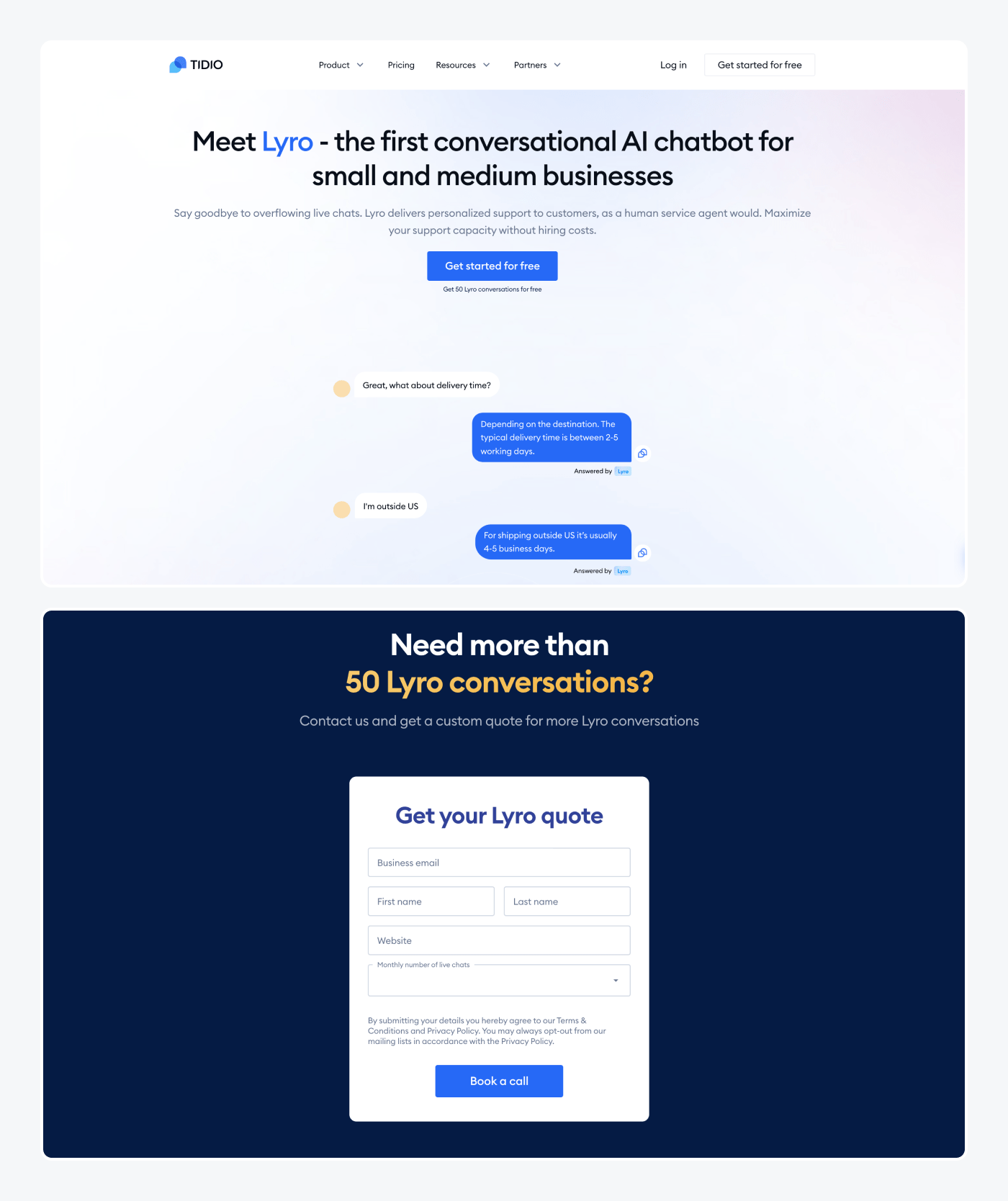
Here is an example of a lead generation landing page. This one is about Lyro—the brand new Tidio’s AI-based feature that includes a conversational AI chatbot designed to provide customer service automation for small and medium businesses.
Lead generation landing page examples
Every well-done landing page gives the visitors some catchy details about the featured product or service and is focused on one offer for the specific target audience.
The best ones, with the highest conversion rate, include some common elements in their landing page design:
- Eye-catching images
- Action-oriented copy describing the benefits of the featured product/service
- Clear call-to-action (CTA)
Now, let’s have a look at 10 great-performing lead generation landing page examples and see where their power lies.
1. Backlinko Newsletter
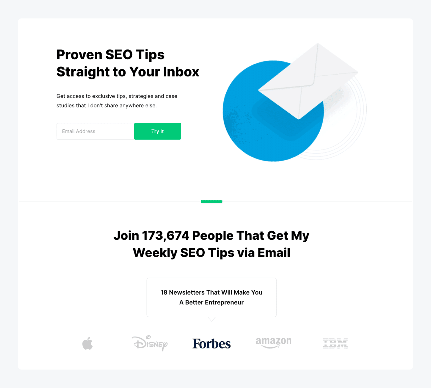
Backlinko, founded by Brian Dean, is a globally-known platform that shares top-quality SEO training and link-building strategies with its subscribers. Their landing page used for subscribing to a newsletter is a great example of how this page should look like.
What works well here?
- Straightforward copywriting
- Feeling of uniqueness and exclusiveness
- FOMO effect
- Simple sign-up form
Starting from the beginning, let’s take a look at the copy. It’s all clean and straight to the point, which makes this page one of the best landing pages for lead generation. No unnecessary fillers, just short and specific messaging.
Also, with the use of words and phrases like “straight to your inbox”, “exclusive”, and “strategies I don’t share anywhere else”, they create the impression of uniqueness of their newsletters. And, most importantly, these words simply drive sign-ups, which makes the whole page a great example of how to make a successful newsletter campaign.
On top of that, the phrase “I don’t share anywhere else” creates the FOMO (Fear Of Missing Out) effect. Visitors know that this is the only place where they can get access to the offered knowledge.
The FOMO, although quite easy to recognize by marketers, is still a great way to drive sign-ups on your landing page. According to researchers, 60% of people make purchases because of FOMO, mostly within 24 hours.
Another thing that surely increases the conversion rate is the short sign-up form. The only thing the Backlinko team asks of you is the email address. No redundant information, no complex forms, just an email.
Simply put, Backlinko shows how to perfectly collect newsletter subscriptions for their email marketing campaigns by using simple messaging, minimalistic design, and a short sign-up form.
Read more: If you’re working on email marketing or need to know more about the topic, be sure to check out 10+ essential email marketing statistics prepared by our team.
2. AI-powered telemedicine report by Infermedica
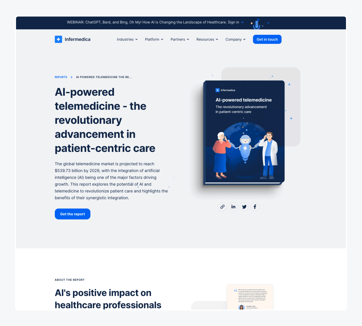
Another example of the best landing pages for lead generation is the one from Infermedica. This company provides an AI-powered SaaS platform that collects, analyzes, and employs medical knowledge. On top of that, the platform also provides advanced reasoning technology to identify patients’ conditions.
As they are very successful in the medical industry, there is no wonder their landing page with the downloadable PDF report is an example worth following.
What’s good here?
- Copywriting adjusted to the specific target audience
- Clear description of the unique value of the report
- Simple and actionable CTA
Unlike in the previous example, the copywriting is a little bit more expanded, but it’s not a mistake. Having in mind that the report is targeted to a specific, and rather narrow group of people, more detailed info about what’s inside the report is a plus. It allows the report to stand out from the rest and show its unique value.
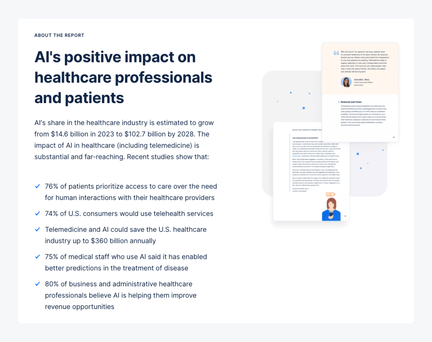
When it comes to the form, it’s also a bit longer than in Backlinko’s case, but it’s still short and doesn’t require any redundant info. Just a name, business email, name of the company, country, and job title.
The CTA button is also short and straight to the point. “Get the report” clearly explains what will happen after clicking on the button, it’s visible, and catches the eye.
So, if you’re looking for high-converting landing generation website examples for more specific and narrow target groups, this one should be on your “to follow” list.
3. Asana Intelligence
Now let’s take a closer look at one of our favorite examples of B2B lead generation landing pages. Asana is a web and mobile work management platform used by companies to organize, track, and manage their ongoing projects. And, if you’re looking for the models of the best landing page, you should definitely take a look at the web page promoting their new product—Asana Intelligence.
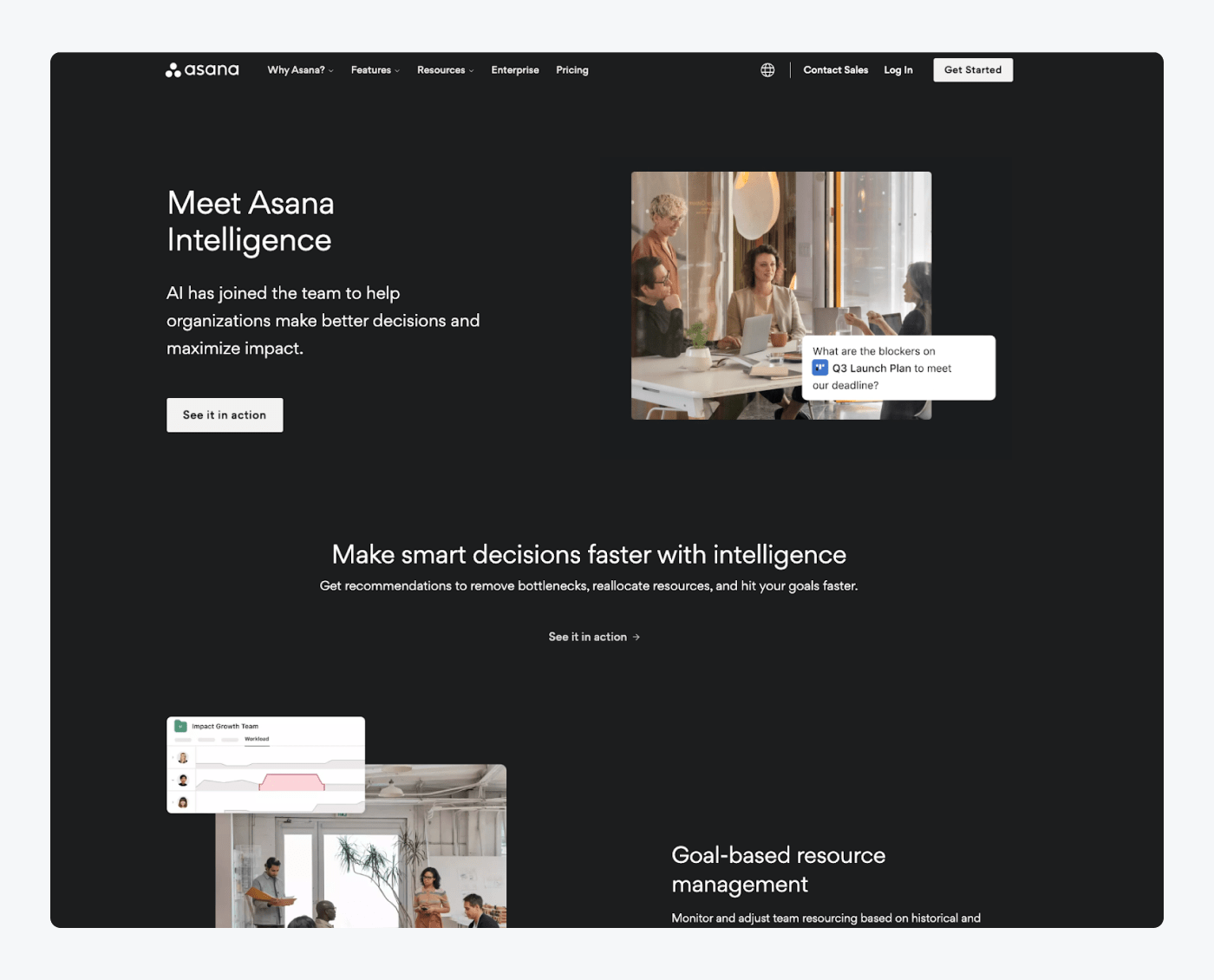
What’s good here?
- Minimalistic, eye-catching design
- Copywriting focused on value and benefits for end-user
- Clear descriptions of the features
What’s most conspicuous is the minimalistic design and a lot of space between the sections. The copywriting is also reduced only to the essentials, with no redundant fillers, unnecessary adjectives, or introductions.
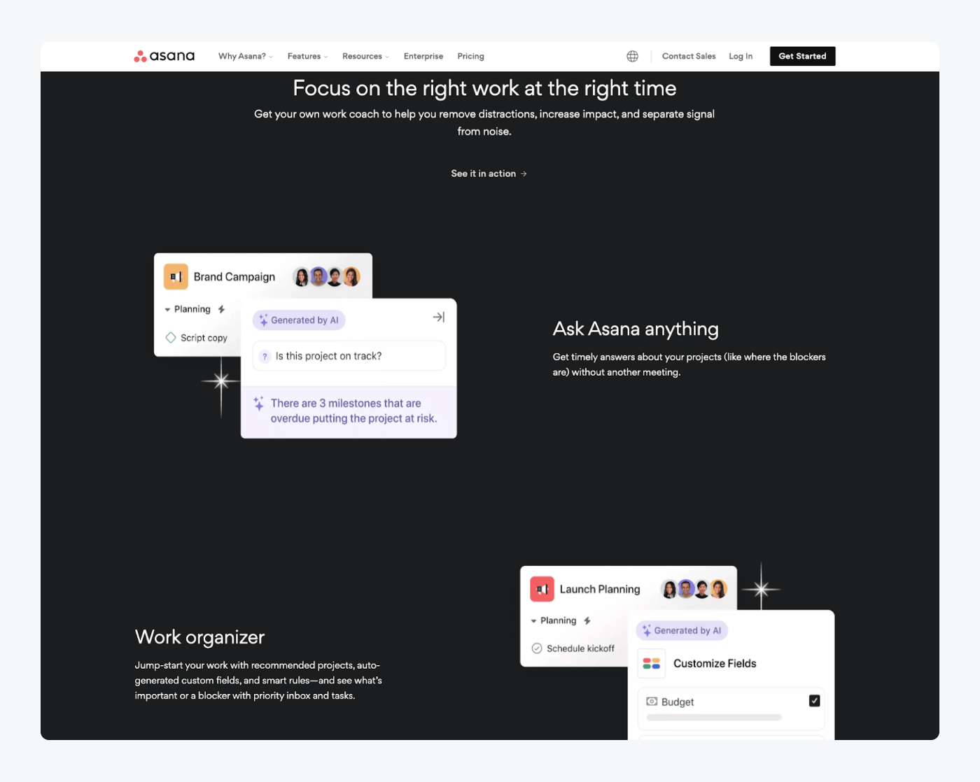
Also, this lead capture landing page clearly describes the features of the upcoming product, showing screenshots and short descriptions of each one. It makes the visitors fully informed about what the featured product is about. Thanks to that, the people can easily verify if it’s something they may need and Asana gets better quality leads. Simple win-win situation.
4. Sprout Social’s worksheet landing page
Sprout Social is a social media management and analytics platform designed to help businesses manage their social media presence effectively. It provides a suite of tools and features to streamline social media marketing, engagement, publishing, and analytics across various platforms.
Their landing page is an example of how to clearly present what your product or service is about so that visitors are well-informed from the very beginning.
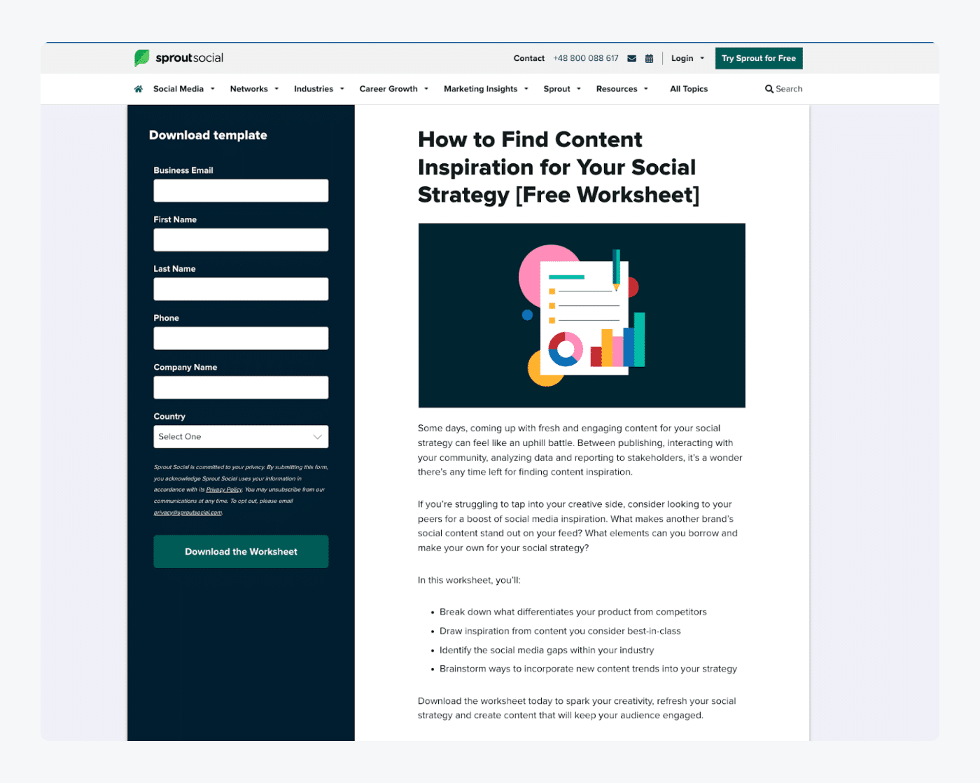
What works well here?
- Clear headline
- Copywriting techniques (bullet points, short paragraphs, etc.)
- Simple and clear CTA
First of all, copywriting. The headline is simple and to the point. The rest of the copy is a bit longer, but it’s not a mistake. Having in mind that these worksheets are targeted to a specific and narrow audience, sharing more details about their functionalities and benefits is a plus. It simply emphasizes their unique value and, in consequence, gathers better-qualified leads.
What’s more, the copy is easy to consume. Thanks to white spaces, bullet points, and short paragraphs, it is easy to read the whole piece fast and remember most of the information.
Also, the CTA button is simple, clear, and focused on action.
On top of that, the design of this landing page is clear and consistent with the Sprout Social’s brand colors. And having a design that matches your brand is another great way to show your proficiency and maintain visitors’ trust.
5. Trulia
Now, let’s take a closer look at Trulia. It’s an online real estate marketplace and platform that provides information and tools for buying, selling, and renting properties. It offers a range of services to help individuals and real estate professionals make informed decisions about real estate transactions and find their ideal home or investment property.
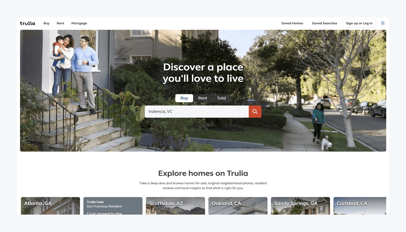
What’s good here?
- Clear and engaging headline
- Actionable design
Let’s have a look at the top of the page—the headline is pretty clear with simple messaging. What’s worth mentioning is the possibility to choose one of three options the platform offers—Buy, Rent, and Sold. It speaks directly to all the target personas—people who want to buy a house, rent it, or sell the property. What’s more, visitors who are landing on the page are nearly required to make a decision about what action they want to take on the page.
6. Ad Hoc Atelier
Now let’s talk about Ad Hoc Atelier. It’s a marketplace where people can find the best quality customizable products for men and women, 100% handcrafted in Italy.

What works well here?
- Clear design
- Catchy headlines and messaging connected with the company’s slogan
- Live chat button
First of all—the landing page design. Everything is clear from the beginning—what’s the scope of the company, what they are selling, and what their products are about. Most of the messaging is included in one, catchy headline, “Personalized products with your initials.”
Below, you can see a subheading saying that “Here’s the best selection of personalized made in Italy products. Be remembered with something real unique.” It creates the feeling that, by choosing their personalized products, people can emphasize their unique and original style with dedicated, hand-crafted accessories.
Also, as you can see in the bottom right corner, there is a live chat button. Thanks to that feature, visitors can easily get in touch with the company and find answers for the questions related to Ad Hoc Atelier’s products, shipping time, and more.
Read more: Find out how a real estate data platform achieved a 138% increase in lead generation with Tidio’s live chat and chatbot solutions.
Learn how to get more leads and boost your sales using AI
7. Campaign Monitor’s Email Academy
Campaign Monitor is an email marketing and automation platform that helps businesses create, send, and track effective email campaigns. It provides a range of tools and features to design visually appealing emails, segment and target audiences, and analyze campaign performance.
So, it’s no surprise that their Email Academy campaign is a great example of using lead gen pages as a part of digital marketing strategy.
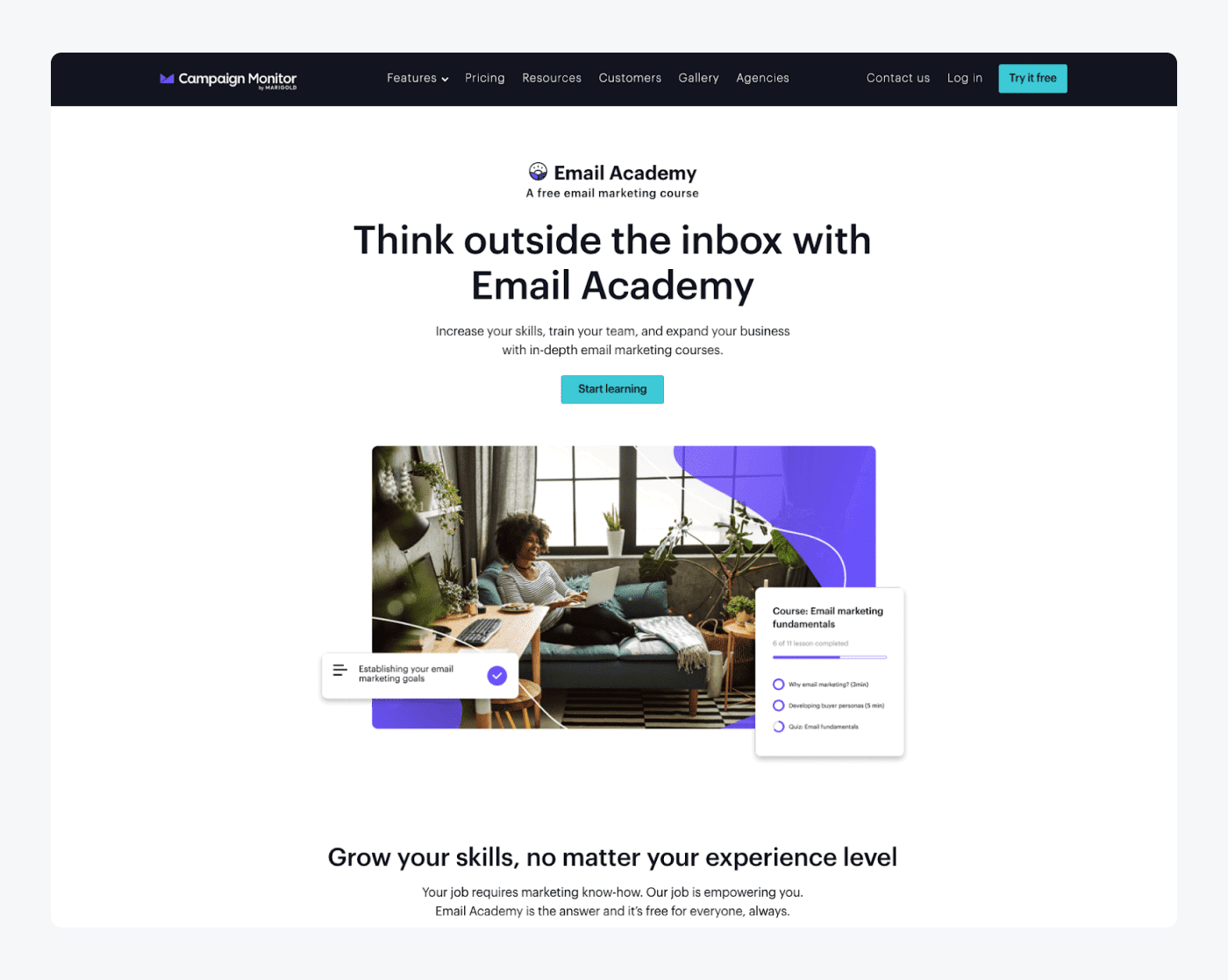
What works here?
- Short, consistent and scannable copywriting
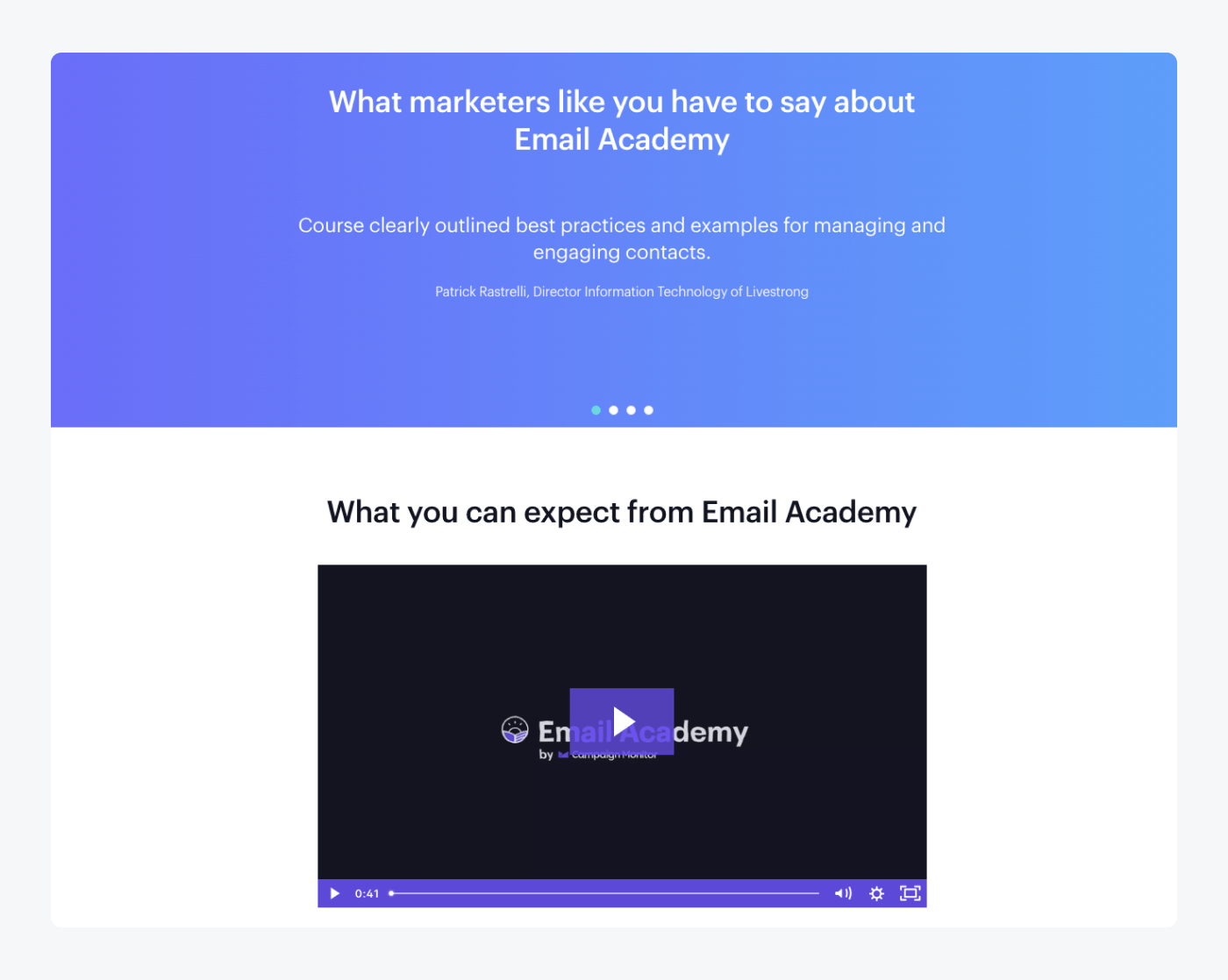
- Testimonials as a social proof
- Video presenting the benefits of joining their academy
This lead capture landing page does a nice job of letting visitors know what to expect after signing up for the course. Just by scanning the short and consistent copy, people can quickly verify if it’s something they are interested in.
What’s more, the Campaign Monitor team included some testimonials as social proof of their course. It’s a super easy and effective way to increase the credibility of the featured course and shows that it brings a real value to the users.
Another great element of this web page is the video presenting what people can expect from the Email Academy. If your page visitors are mostly skimmers, it’s definitely something you should consider using on your lead generation landing page.
8. Ckbk
Ckbk (pronounced “cookbook”) is a digital platform and subscription service that provides access to a vast collection of high-quality recipes. These come from cookbooks by renowned chefs and food writers. It’s designed to be a comprehensive resource for cooking enthusiasts, home cooks, and professionals seeking culinary inspiration and guidance.
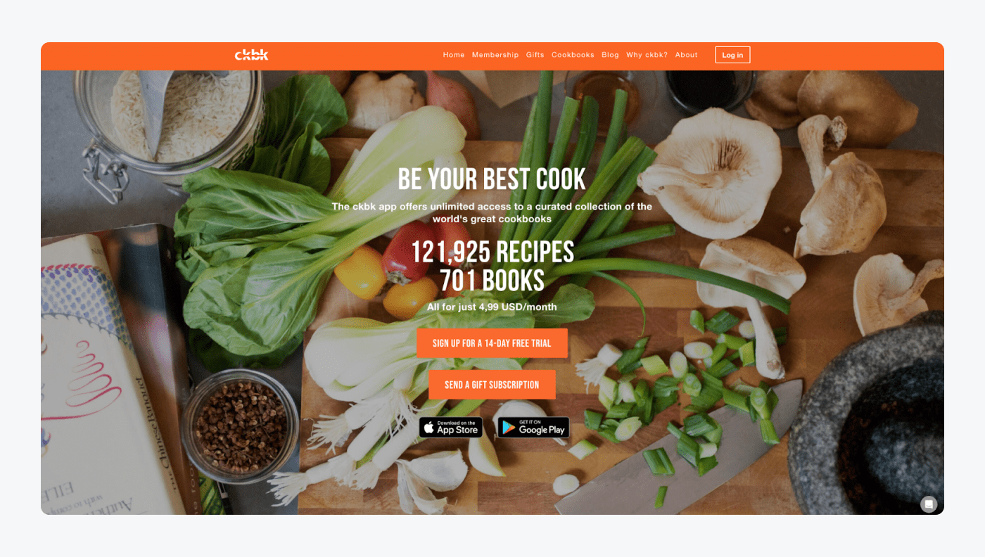
What’s good here?
- Value-oriented copywriting
- Short and straightforward headlines and subheadings
- Clean and intuitive design
Their lead capture landing page is a great example of value-oriented copywriting, focused on benefits for the subscribers and the content of their cookbooks. They managed to include their unique value proposition, main benefits, and short info about the content in six lines. It’s a great example of the economy of language and copywriting masterclass.
Also, they put a pop-up ad for new visitors on the page, so they could get a free digital cookbook as a demo version of their paid books.
9. Brandwatch
Brandwatch is a social media listening and analytics platform that helps businesses monitor and analyze what’s being said about their brand. It collects online conversations, sentiment, and trends related to their brand, industry, or specific topics. It enables organizations to gain valuable insights into consumer opinions, track brand reputation, and inform their marketing strategies based on real-time social media data.
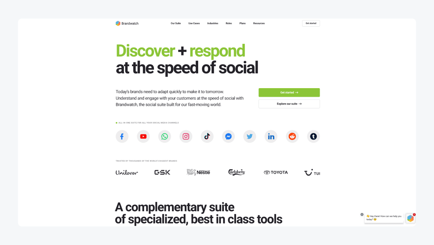
What works here?
- Clear and informative headlines
- Current clients’ logotypes
Their lead generation page is a clear example of how companies should present their services in a clear and customer-oriented way. Starting from the top of the page, the headline perfectly explains what the company does and what clients can get from choosing their services.
Brandwatch also shows logotypes of widely-known brands they cooperated with, which increases the overall credibility of the company and presents them as experts in their niche.
10. Tiffany & Co. email signup landing page example
Tiffany & Co., commonly known as Tiffany, is an American luxury jewelry and specialty retailer. Founded in 1837, Tiffany is renowned for its high-quality diamond jewelry, engagement rings, luxury accessories, and sterling silver products. And, since most of our clients are from the ecommerce industry, it’s time for an example from this area.
As the luxury jewelry brand, Tiffany’s email signup landing page is shining bright like a diamond.
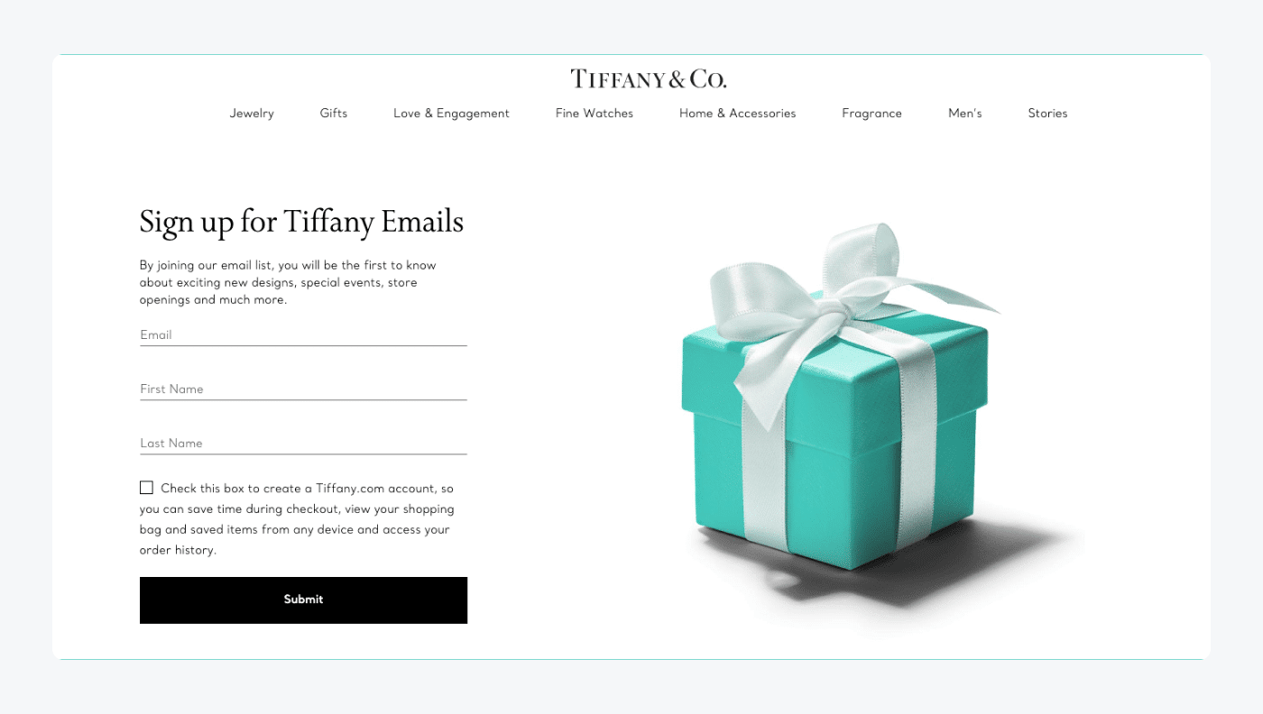
What’s working here?
- Elegant design
- Clear CTA
The whole page is elegant, minimalistic, with an on-brand image on the right side to grab the visitors’ attention. The copywriting is focused on benefits, with a clear explanation of what subscribers will get from signing up.
Okay—
that concludes the list of best lead generation landing page examples.
Now, let’s find out how to create a great-performing lead capture page exploring pro-tips on how to optimize a landing page for lead generation.
How to create a lead generation landing page: best practices
To make your landing page do its job, it has to be well-optimized for gathering leads.
But what does it mean?
We recommend that you follow the battle-tested best practices and pro-tips. Here are the key things to remember.
1. Remember about clear landing page design
No matter how great copywriting you’ll write or how awesome your product/service is, it will be all in vain if the design of your landing page is scruffy. It will ruin your effort and won’t inspire your visitors to become leads. And even the best advertising or social media campaigns won’t help.
To make your landing page design attractive to visitors and inspire them to take your desired actions described in the CTA button, you should make it clear and understandable for everyone.
So, to properly create your lead gen landing page design, you need to:
- Harmonize your theme’s colors so that they’re in line with your brandbook
- Clearly differentiate the headlines
- Play on shapes and symmetry
- Make your texts short, specific, and easy to read
- Include visible and standout call-to-action buttons
2. Prepare and present a solid UVP (unique value proposition)
Preparing a solid Unique Value Proposition (UVP) involves effectively communicating the unique benefits and value that your product or service offers to your target audience. Here are some steps to help you prepare and present a strong UVP:
- Understand your target audience
Start by gaining a deep understanding of your target audience. Identify their needs, pain points, and desires. This knowledge will help you tailor your UVP to resonate with them specifically.
- Identify your unique selling points
Determine the unique aspects of your product or service that set you apart from competitors. Consider what makes you different, better, or more valuable. These unique selling points will form the foundation of your UVP.
- Focus on customer benefits
Frame your UVP in terms of the benefits it provides to customers. Clearly communicate how your product or service solves their problems, fulfills their needs, or improves their lives. Highlight the value they will gain from choosing your offering.
- Keep it clear and concise
Craft a concise and easily understandable UVP. Use simple language that captures the essence of your value proposition in a few sentences or a short statement. Avoid jargon or complicated terminology that may confuse your audience.
- Make it memorable
Create a UVP that is memorable and stands out in the minds of your audience. Use language that is unique, compelling, and resonates with their emotions. Also, consider using a catchy tagline or incorporating storytelling elements to make it more engaging.
3. Add a live chat/chatbot button
Adding a chatbot or live chat button on a lead generation landing page can offer several benefits to your businesses. Here are some reasons why it can be valuable:
- Instant communication
Live chat or chatbot functionality allows visitors to engage in real-time communication with your business. It provides a convenient way for potential leads to ask questions, seek clarifications, or get immediate assistance. Instant communication can enhance the user experience and increase the likelihood of capturing leads while they are actively engaged and interested in your offering.
Read more: Check out how Integratec boosted qualified leads by 25% and improved customer support using chat flows from Tidio
- Lead qualification and conversion
Conversational tools can be utilized to qualify leads by asking targeted questions and collecting relevant information. This helps businesses understand the needs and preferences of their prospects, segment them accordingly, and provide personalized follow-ups.
By guiding visitors through the conversion process, live chat or chatbots can increase the chances of converting leads into customers.
According to research, 99% of B2B marketers surveyed say that chatbots have increased their company’s lead-to-customer conversion rate. Going further, 56% of marketers said that chatbots have increased their lead-to-customer conversion rate by at least 10%.
Read more: Explore more chatbots’ use cases and find out what are the biggest benefits of chatbots.
4. Create clear CTA
The call-to-action is the most important part of your lead generation landing page design. A quick reminder—a CTA is an element that aims to trigger visitors to take a desired action—subscribe to a newsletter, sign up for a free trial, download an ebook, etc.
Here are some examples of CTAs used in lead gen strategies:
- Subscribe to a newsletter
- Register for free
- Sign up for a free trial
- Reserve a call
Place a prominent and compelling CTA button on your landing page that clearly tells visitors what action they should take. Use action-oriented language, such as “Sign Up Now” or “Get Your Free Trial,” and make the button stand out visually.
Thanks to that, your visitors will feel that they are spoken to directly, which makes your messaging more personal than the standard approach of using “cold” forms like “Registration”.
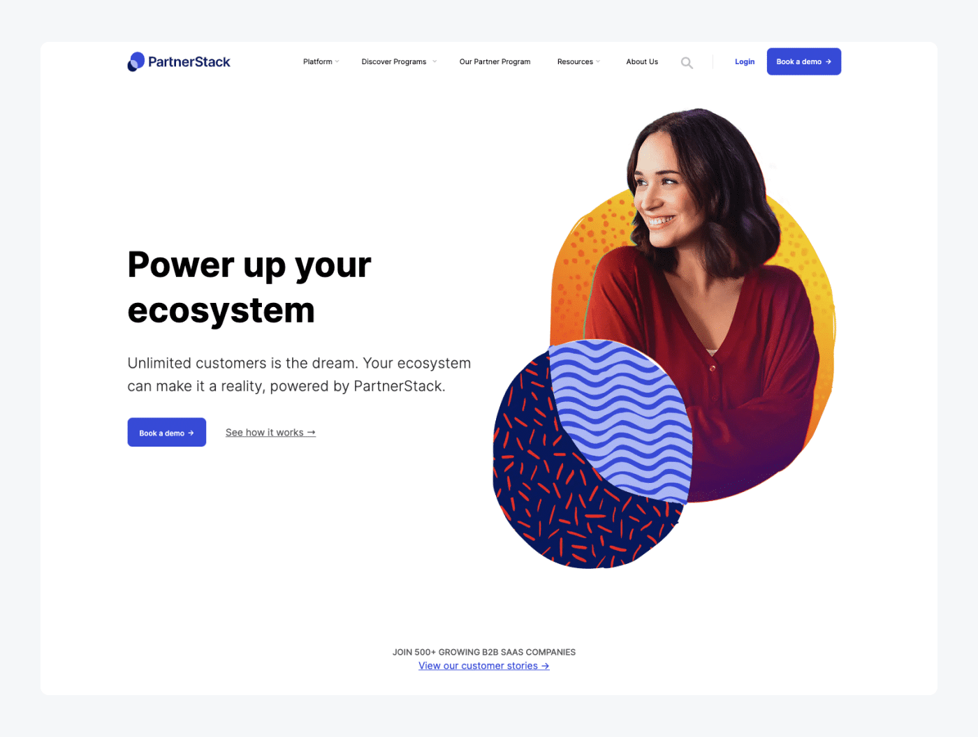
Also, this action-oriented approach to writing CTAs seems to be effective in a battle. PartnerStack, a partner ecosystem platform, increased its conversion rate from 6.66% to 14.09% (+111.55%) just by tweaking its homepage call-to-action copy from “Get Started” to “Book a Demo.” Just food for thought.
5. Optimize your forms
A sign-up form is a final step to capture your lead with the lead gen landing page. So make sure that your forms are of top quality, a cherry on top. And maybe it looks like a piece of cake to you—
But there is also a devil in the details here.
The secret lies in simplicity. Here are a few pro-tips that will help you to create great-converting landing page forms:
- The fewer questions, the better
Make your landing page form as short as possible. Asking for too much redundant information is counterproductive and can scare off your visitors from filling them in. Ask only for the necessary info during the rest of the process—phone number, email address, name, maybe number of their employees (only if it will help you serve them better in the following stages).
- Less writing, more checkboxes
The form should be easy to fill in. So, don’t force your visitors to write. Instead, replace all the possible written forms with checkboxes. Thanks to this simple trick, you can optimize your lead gen landing page because your form will be easier to use. Plus, the chance of getting leads will only increase.
- Expose benefits and value for the customer
You aren’t creating a lead generation landing page for yourself. It’s for your visitors. So, ensure that the copy of your form highlights the benefits and value your visitors will get if they fill in the form and share their personal information with you. Remember to put your visitor in the spotlight.
- Build social proof with customer testimonials
Even if your product or service is great, and you’re almost 100% sure people will love it, it’s always a good idea to support it with strong social proof. And testimonials from your existing clients are working perfectly here.
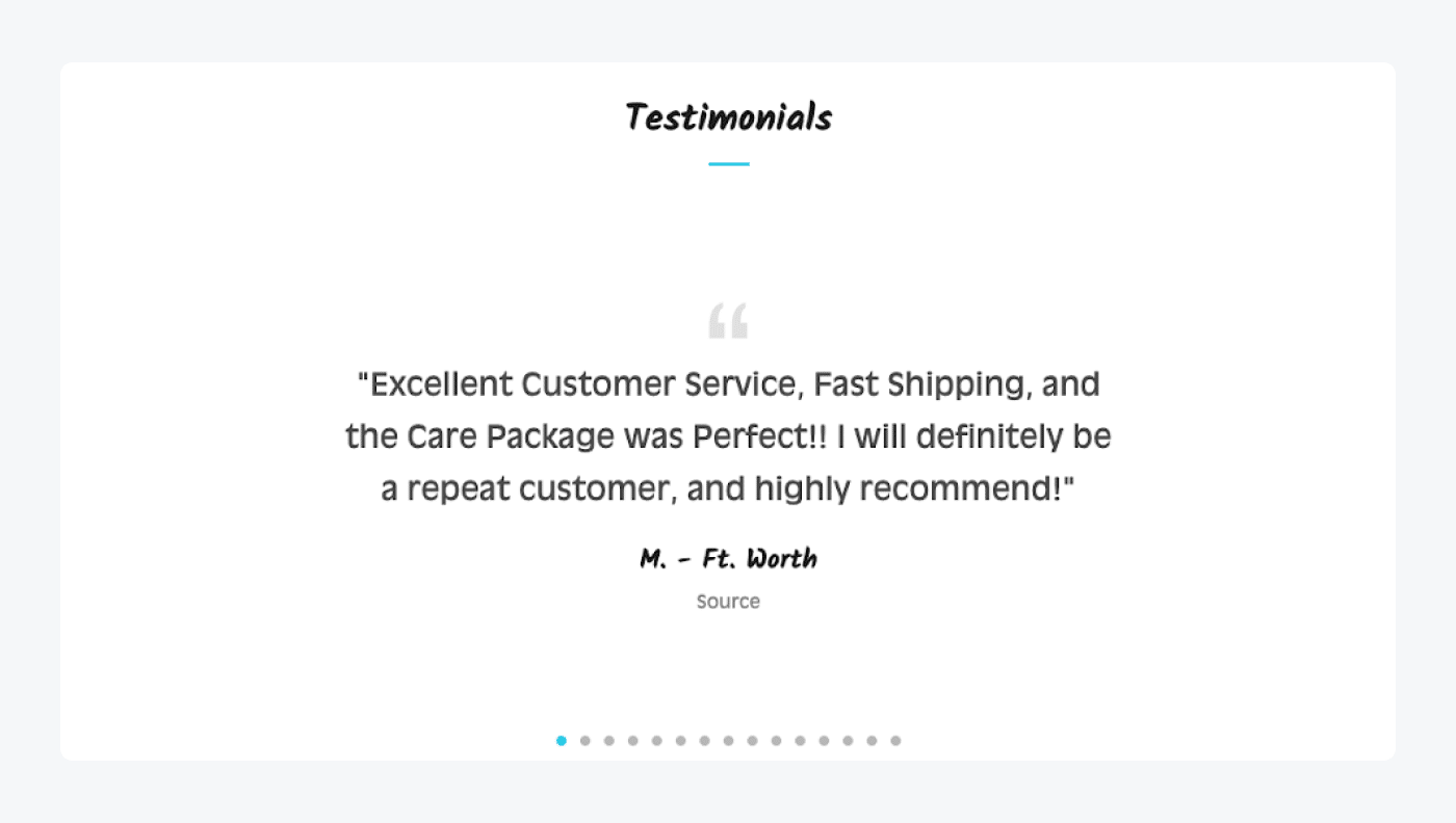
People are usually influenced by trends and recommendations when it comes to making buying decisions. That’s why any kinds of customer testimonials or influencer marketing campaigns should be a part of your lead generation activities.
In fact, 9 out of 10 people trust what a customer says about a business more than what that business says about itself.
6. Prepare limited offers to create FOMO
As we’ve already mentioned this abbreviation, you know what FOMO stands for. The sense of scarcity and urgency is a great (and a little bit sneaky) way to boost conversion rates.
Your goal here is to create a deadline of your offer to push your visitors to take action described in your CTA button. Thanks to that, people will need to make their decisions faster. And to make these decisions, they will have to focus more on your landing page and discover the benefits of your products/services.
7. Use language of benefits
Keep the copy on your landing page focused and concise, highlighting the key benefits and value of your offer. Use persuasive language, bullet points, and subheadings to make the content scannable and engaging.
8. Optimize your landing page for mobile users
Ensure your landing page is mobile-friendly and responsive, as an increasing number of visitors access the internet through mobile devices. Optimize the page layout, font sizes, and form fields to provide a seamless experience on smartphones and tablets.
Also, don’t forget to optimize the loading page time. A dynamic landing page was found to convert 25% more mobile users, compared to a normal landing page.
Lead generation landing page templates
Wix, Unbounce, and Envato are popular platforms that offer landing page templates, each with its own set of features and design options. Here’s a brief description of lead generation landing page templates available on these platforms.
1. Wix lead generation landing page templates
Wix provides a user-friendly website builder with various customizable templates, including lead generation landing page options. Their templates are visually appealing and responsive, meaning they adapt to different screen sizes and devices.
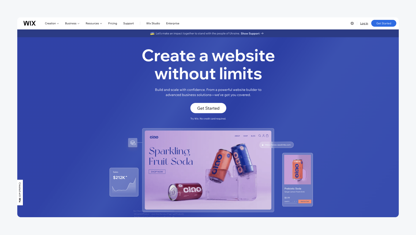
Wix offers a drag-and-drop functionality, allowing users to easily customize elements, add forms, and integrate with popular email marketing platforms. They also offer predesigned sections and layouts specifically optimized for lead generation purposes, such as contact forms, call-to-action buttons, and testimonials.
2. Unbounce templates
Unbounce specializes in landing page creation and optimization. They offer a wide range of professionally designed lead generation landing page templates. These templates are highly customizable, and users can modify elements, change colors, add forms, and personalize the design to match their branding.
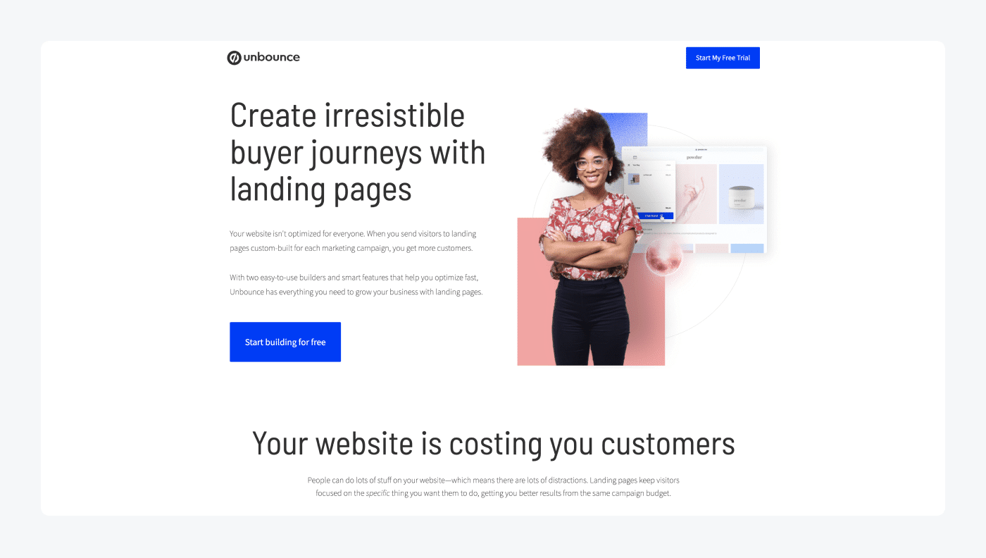
Unbounce provides a drag-and-drop editor with advanced features, such as A/B testing and dynamic text replacement. Their templates focus on increasing conversion rates, with attention to clear call-to-action sections, social proof elements, and optimized form placement.
3. Envato market templates
Envato is a marketplace that offers a diverse selection of landing page templates through its ThemeForest platform. Once there, users can browse through various lead generation templates designed by different authors.
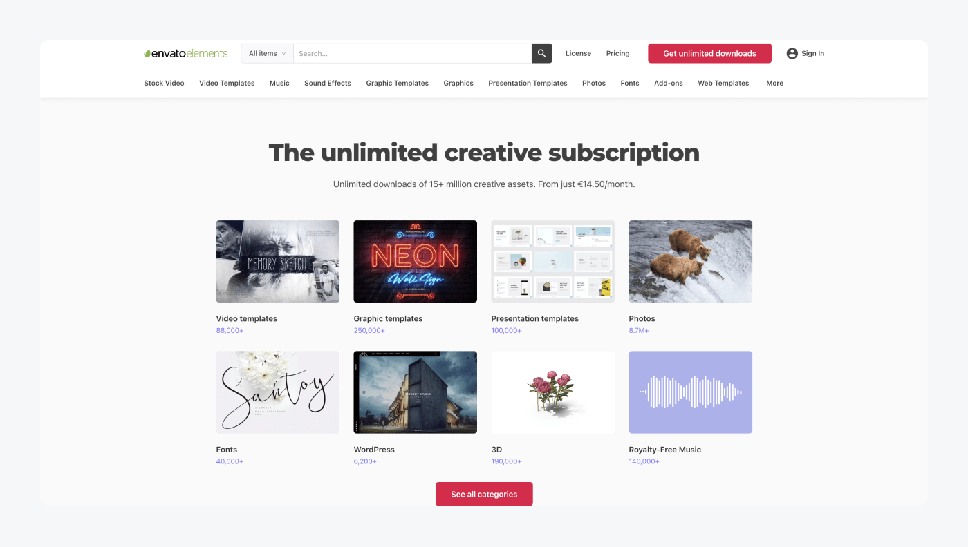
These templates cover a wide range of industries and purposes, including lead capture. Envato provides detailed descriptions, previews, and user ratings for each template. The templates are often fully customizable and come with different layout options. On top of that, Envato offers several integration capabilities, and additional features like countdown timers, video backgrounds, or pricing tables.
Lead generation landing page: summary
So, to wrap everything up—
When creating a lead generation landing page, you need to focus on customers’ side and emphasize what they will get from doing what you’re asking them for in the CTA button.
Remember to present them with your unique value proposition, explain clearly what your product or service is about, be straight to the point, and don’t force them to share too much unnecessary info.
Also, you should pay attention to the design of your lead capture landing page. Make sure that it’s consistent with your brand colors and that it’s easy to read.
And when it comes to reading—don’t write a long copy. Focus on short sentences full of content. Avoid redundant fillers like introduction phrases, etc. Be specific, customer-oriented, and focus on value. That’s the best way to create great-performing landing pages perfectly optimized for conversion.

