Have you ever noticed that wine seems to taste better when it comes from a nice-looking bottle?
But labels and packaging don’t really change the taste, right?
Well, here is the thing—
According to scientists, they do!
Expectations shape our experiences.
When people like packaging designs, they enjoy products more. And it can give businesses a huge competitive edge. They make customers curious or happy long before they even touch, taste, or use the product.
Good package designs should be an essential element of every brand strategy.
In this article:
- What product package design is
- Examples of good packaging
- Best practices and tips for package designers
- Free box design templates
Find out how to use AI-assisted service to boost customer satisfaction
If you are just pre-planning the launch of your online store or product, you might also be interested in:
- Top Ecommerce Platform Comparison [For Online Stores]
- The Best Online Selling Platforms [Free Websites to Sell Items]
- Shopify vs WooCommerce [Feature & Price Comparison]
Now—
Let’s find out what makes custom box designs work or not.
What is packaging design?
Packaging design is the art of creating memorable and practical product packages. It involves the choice of materials, typography, colors, and imagery. The design should be consistent with the branding strategy. Package designs must also address functional aspects, e.g. storing items in a specific way.
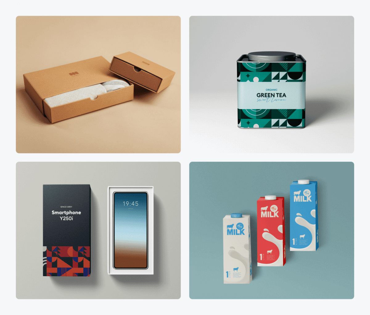
Visual appeal can be assessed by customers in as little as 50 milliseconds. That’s why it is extremely important to make a good first impression.
Functional magnetic resonance imaging experiments show us how visual cues influence our perception. On a physiological level, the taste of tea activates only one brain region. But once you know what the brand is, your whole brain awakes. That’s why Coke tastes better when consumed from a cup with the Coca-Cola logo.
A packaging design process is different from a typical 2D graphic design. Package designers use Adobe Creative Suite, just like the rest, but dieline projects need to fold, labels need to adjust to the roundness of the bottle, and so on.
The most common types of packaging are:
- Boxes
- Bags
- Packets
- Pouches
- Tubes
- Bottles
- Jars
- Cans
- Wrappers
Custom boxes with a logo are the most common product packaging. They are used for the majority of dry goods.
Usually, the type of packaging is determined by the type of the product. Still, you can choose between different packaging options. This may depend on tradition or even regional preferences.
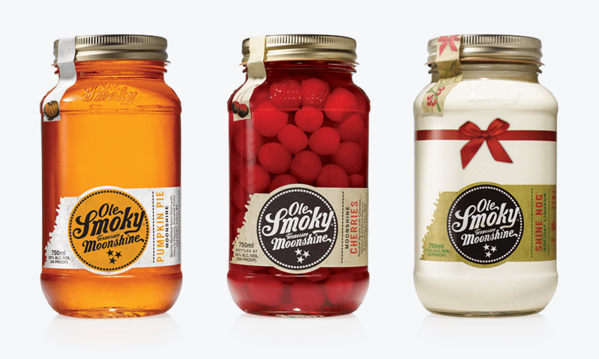
For instance, do you buy your mayonnaise in a jar or in a tube? Do you find your favorite juice more convenient in a pouch or a bottle? Does the fact that moonshine is being sold in mason jars affect its taste in any way?
Unique packaging choices
Packaging solutions don’t need to be boring or obvious. You should consider many factors and several packaging type ideas. Maybe an elegant jar with a custom label would be a better choice for your artisan sweets than a regular chocolate box.
If you are manufacturing your own products and running your own online store, you should actually consider two “layers” of packaging. One is your shipping box design and the second is the actual packaging of the product itself.
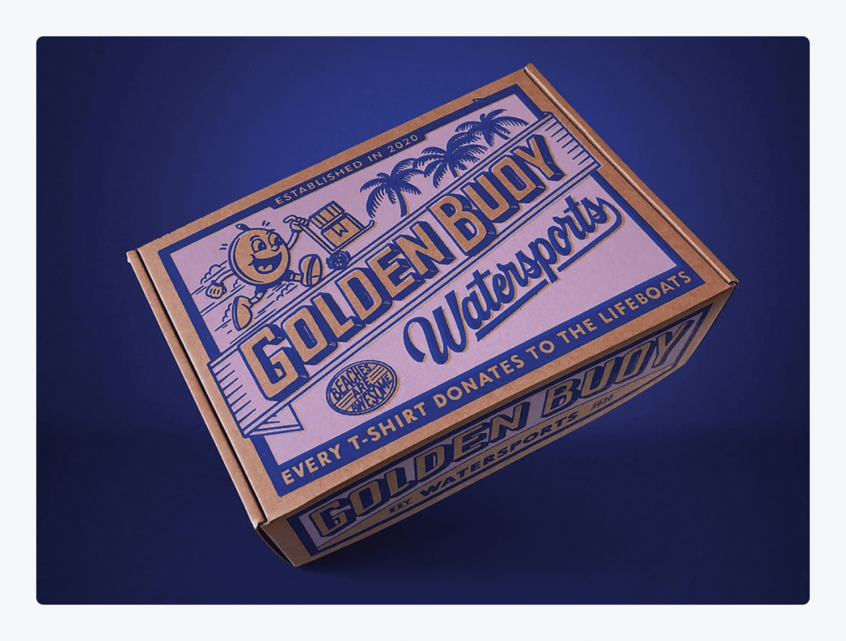
Custom design shipping boxes give you yet another opportunity to communicate with customers. Since they are quite big, you can use more space and unleash your creative energy.
Creative package design examples
Never before in history has the power of unique design been so strong. You don’t know the day or the hour when an unboxing video featuring your product goes viral on social media. Well, unless you do, of course. For instance, check out this video showing the unboxing of a new Motorola phone.
As you can see from the example above, sometimes unique premium boxes are designed specifically for influencers and reviewers. Art directors and brand designers are now outdoing themselves in creating eye-catching packaging. According to a research study by Ipsos, 72% of American consumers confess that packaging influences their shopping choices.
Let’s take a look at a couple of some good package design examples.
1. Custom boxes with logos
If you have a chance to showcase your brand identity then you should take it. Mailer boxes with logos are the most universal type of packaging that fulfills both functional and marketing purposes.
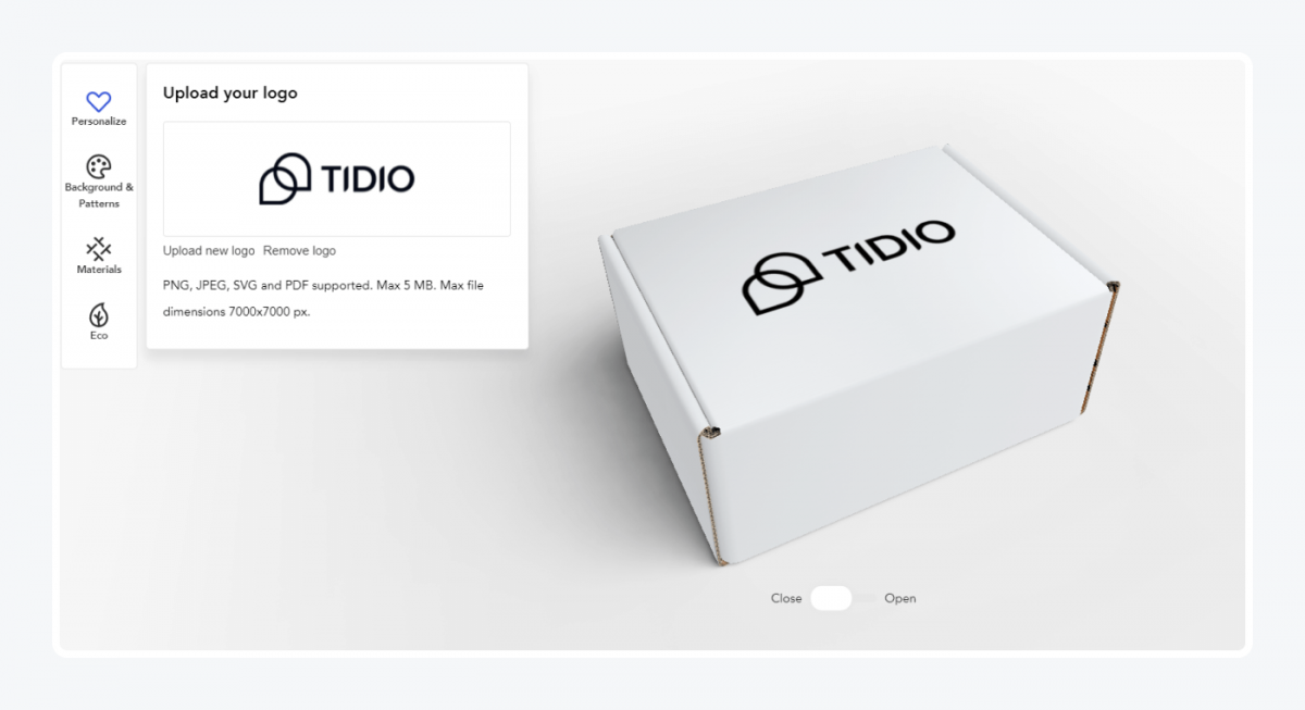
You can order a custom shipping box with your logo from companies such as Packhelp. You can choose the type of mailer box and design them using an online editor. You can do this without using Photoshop. While working on your design you can even visualize your box project in 3D.
Does ordering custom packaging seem beyond your budget? Consider using stickers instead. You don’t have to prepare branded boxes. Just print stickers with your logo and put them on regular shipping boxes. And if you are still working on your logo design, read our guide: Good and Bad Logo Examples From Companies
2. Personalized shipping boxes
A box doesn’t have to be created by a professional designer at all. It’s more about the personal touch and building customer relationships.
When it comes to packaging, small business owners can get a lot of creative DIY ideas from video tutorials. Here are some examples of sustainable (and cheap) packaging hacks that you can try out:
Customers will appreciate your commitment. If it is clear that a unique packaging was made just for them, they will consider it a nice gesture.
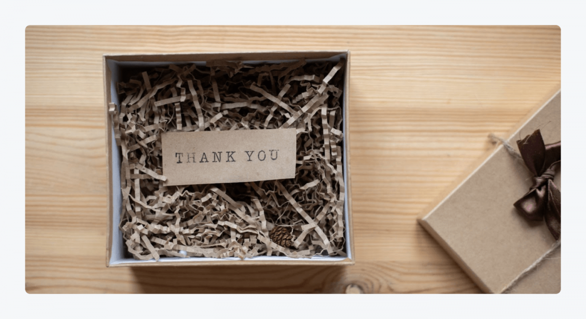
One of the most effective ways to build customer loyalty is to include a personalized thank you for your purchase note.
Customers spend 40% more money on brands they interact with on social media.
But how do we get people to visit our Facebook?
Well, if you want, you can attach a card with a QR code with a link to your Messenger chatbot. You can set up automatic chatbot conversation scripts to collect feedback. Use chatbots to ask questions about product quality, customer experience, or to measure customer satisfaction. They are like interactive customer satisfaction surveys.
3. Cute box design
Many customers can be reached by product and package designs that are heartwarming to them. Cute animals, pastel colors, and minimalist cartoon characters can’t go wrong among certain demographics.
Charming design projects make an excellent first impression. You can use a cute character in a label design but the shape of your packaging itself can creatively evoke an animal or a flower.
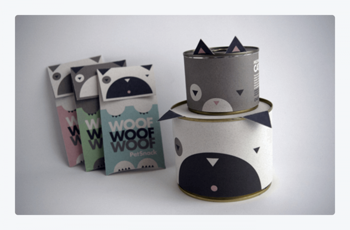
If you intend to add some adorable design elements, make sure they match your customers’ persona. What works great as food packaging for kids does not necessarily work for health supplements or cannabis.
4. Modern packaging design
If you care about being seen as modern, minimalism is the ultimate way. Go with simple shapes, use clean fonts, and have a consistent color palette. There’s nothing wrong with sticking to black and white too.
Want to know if your design is modern? Here is the ultimate test. Watch this unboxing video of several iPhones.
Then try to imagine your box being opened in similar circumstances and with the same level of intensity.
Now—
Does your project look epic or elegant? Or is it ridiculous?
Modern designs are neutral and ascetic. It makes them perfect for every situation and they don’t draw too much attention to themselves. Just like a professional business card.
5. Simple packaging design
Elegance and simplicity go hand in hand. Sometimes, however, simple and minimalist designs can evoke other feelings as well. There are no limits to creating designs that are straightforward and communicate all sorts of values.
Utilizing a QR Code Creator, you can enhance the simplicity of your packaging by incorporating a scannable QR code that leads customers to a multimedia experience, providing additional information about the product, its origins, or usage ideas.
Take a look at these shipping packs from Koyah.
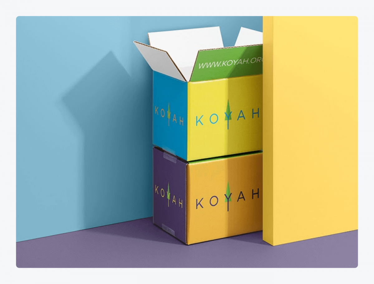
The company sells fruit and vegetable powders—nutritional supplements. Instead of printing elaborate designs, they decided on colored cardstock that speaks for their products. Yellow is the color of a banana, while the others are spinach, orange, beetroot, broccoli, and water. It’s a smart way to have cohesive visual communication with customers.
6. Cool package design
Sometimes designers use the “cool” factor in their creations. This typically entails a much bolder use of unusual combinations, intense colors, and cartoonish illustrations. These types of illustrative print designs are usually geared towards kids and men. Toys or craft beer labels are classic examples of packaging that incorporates this style.
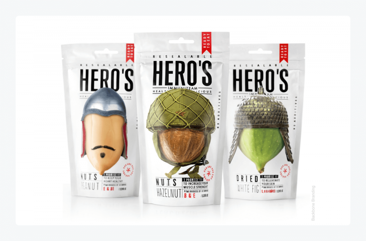
The example above shows nuts and dried fruits stylized as warriors from different historical periods. Juxtaposing the basic oval shapes with human headgear is both playful and creative. The military aspect adds more vibrancy and a more intense feel to the overall look.
Provocative or unusual illustrations can help you get the attention of your customers. American consumers are bombed with as many as 10,000 advertisements each day but only about 100 of them get past the “attention wall” of an average person. Making your graphics look cool and original is critical.
7. Premium package design
Have you ever wondered what makes something look like a premium product?
There is no single formula, but if we wanted to produce an instant “premium” effect, there are several proven methods. This coffee packaging happens to use every trick in the book.
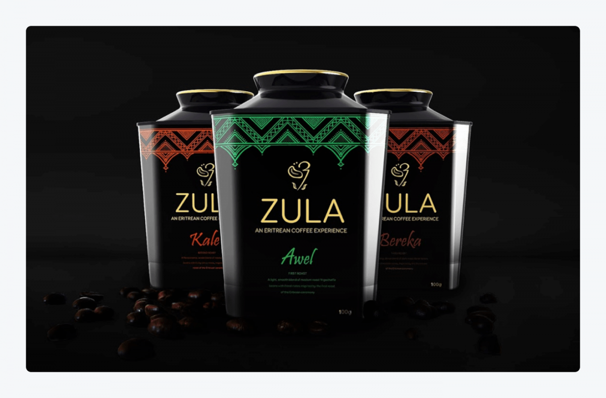
What exactly makes it look so classy and premium? It all boils down to several design elements:
- Black is the color associated with style and elegance
- Golden typography evokes an air of luxury
- Unusual shape makes it unique and rare
- Exotic ornaments create a feeling of mystery and wonder
If you want your products to appear sophisticated, use the design tips above. You should also read more about creating an air-tight sales process for your business sustainability: What Are the 7 Steps in the Sales Process
8. Clever package designs
Some projects can be very innovative or surprising. Try to find analogies to the natural world. Some forms can bear a striking resemblance to common symbols. For example, flowers can be associated with feminine beauty, innocence, and fragility. The example below illustrates how all of these connotations can be used in a clever way.
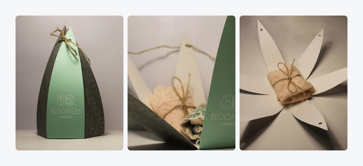
The flower form was used as a lingerie package. Also, the way it opens is reminiscent of a blooming flower. This type of project may seem a bit impractical, but it creates an amazing customer experience.
9. Funny packaging design
Humor can be a powerful weapon. Same as with clever designs, it involves looking for unusual combinations or similarities between the shape or color of different objects. You should remember that context is the ultimate key.
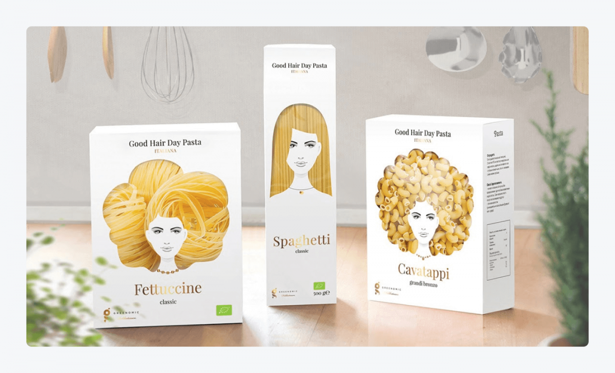
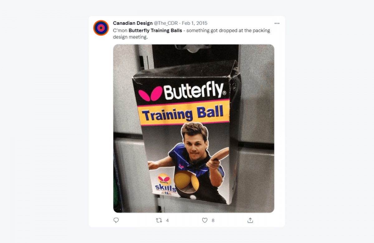
By showing or hiding a product (or parts of it), we can get very funny results. But this type of visual “pun” can sometimes backfire. In the example below, an infamous set of Butterfly training balls for table tennis looks like a pair of breasts.
You can appeal to someone’s sense of humor in a variety of ways. In marketing, making someone smile matters a lot. Funny email subject lines can help you build customer engagement and increase sales.
10. Minimalist package design
We are mentioning this for the umpteenth time in a row—less is more. And the projects that are most memorable tend to be extremely straightforward. Take a look at this line of bathroom products for kids:
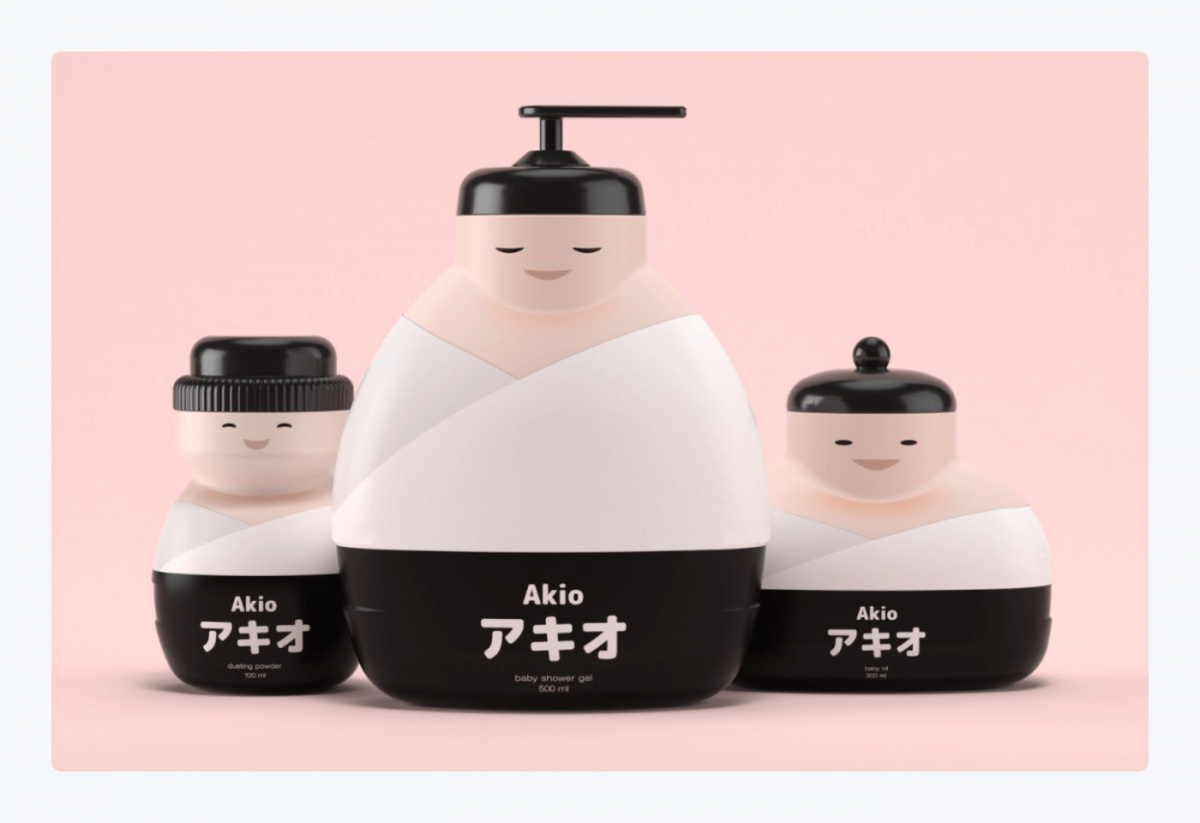
Three colors and some basic shapes are more than enough to create vibrant characters. The Japanese figurines are relatable and they evoke a positive response. The appeal to aesthetic sense and emotions are among the most common tricks used by designers.
Read more: Types of Appeals in Advertising [+Best Examples]
How to design packaging for a product
Package design process is quite straightforward if you break it down into a few steps.
How to design a package for a product:
- Create your customer persona
- Choose the right type of package
- Double-check your competitors’ projects
- Prepare a dieline
- Order your project
For example, let’s assume that we want to design a product packaging for a bar of handmade soap. We would need to:
1. Think about your customers
Try to find out who your potential customers and users are. What age are they? What do they like and what annoys them? What are their aspirations and their values? Good businesses know how to get the right fit for their customers’ needs.
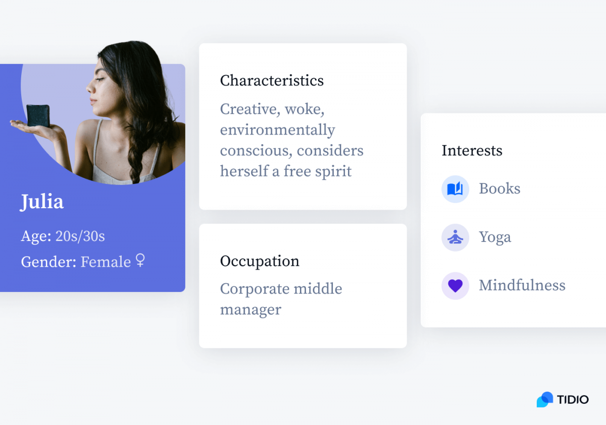
Our artisan soap’s target customers are females in their 20s and 30s. They like organic, local, homemade products and nature. They value things that are simple, raw, and authentic.
Read more: How to Improve Your Company’s Customer Focus
2. Choose the right type of packaging
Think about what size and shape will work best for you. Food products or liquids require a different approach than books or electronics. Think about issues such as size, shape, material, or texture. Does the packaging need to be durable? Do I need to make it from scratch or is it enough to use ready-made packaging and stick a label on it? Consider possible costs, advantages and disadvantages of your choice.
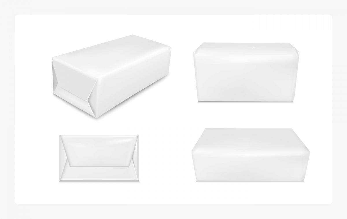
Our soap will use regular gloss paper wrapping. It is practical, easy to make, and a traditional choice for soap products.
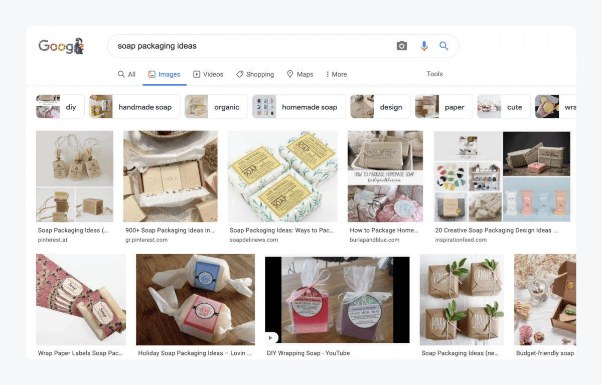
3. Investigate your competitors
Mostly, you don’t need to reinvent the wheel. If you are looking for inspiration then see the solutions used by your competitors. Note down the best ideas and try to combine them to make your packaging even better.
4. Prepare your layout and dieline
Dielines are applied when you need to prepare a graphic layout of your label or product packaging. You can use basic paper cutouts to create mockup versions of your projects. Even the miniature versions will allow you to play with shape and form. You can create scaled prints and experiment with different solutions.
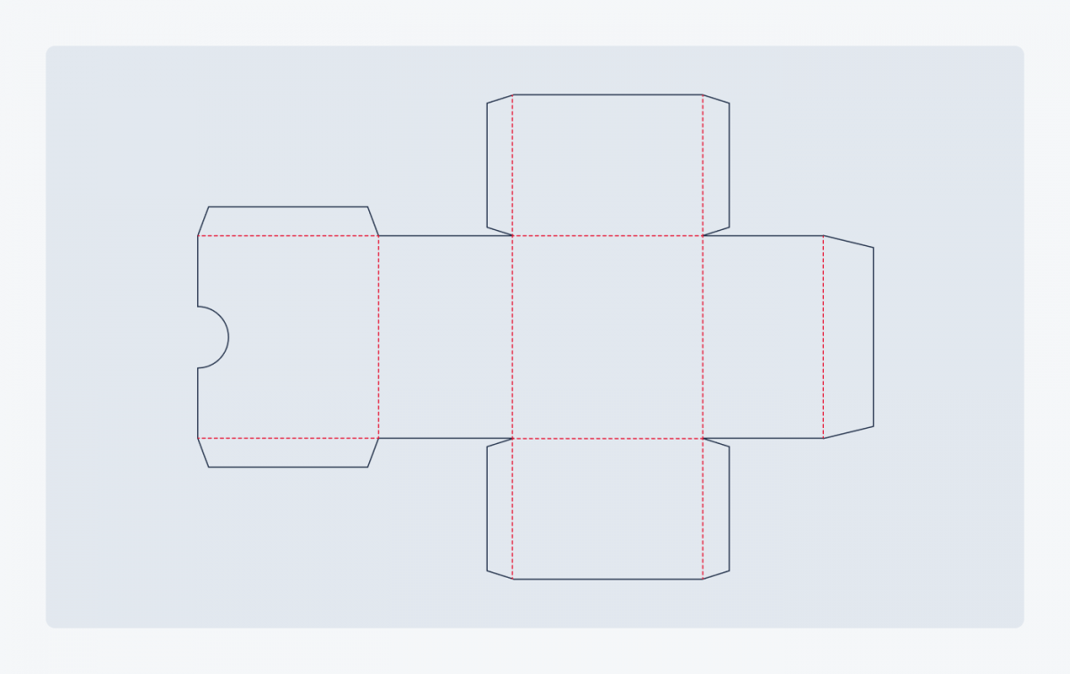
You can download packaging design templates and access additional resources here:
- Free Vector Packaging Templates
- Packaging & Dielines: Free Book
- 14+ Packaging Design Templates
- Graphics Family
5. Order your project and collect feedback
Order your first batch from the print shop. There are a whole range of professional companies offering online printing services. Some of them may even send you samples of their products that you can touch or test. It’s a good idea to get in touch with the print designers directly to discuss the details and clear up any technical doubts.
The final product might look like this.
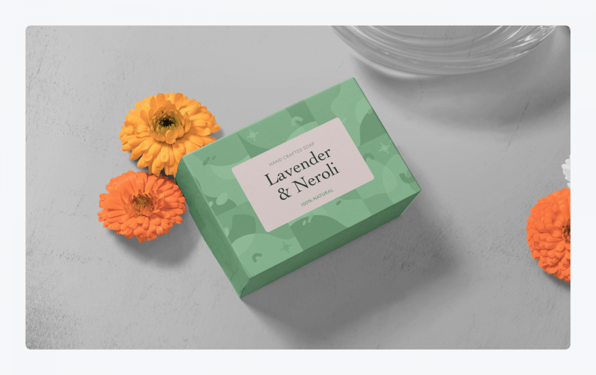
Do you think it will work? The best way is to check what your customers think about it. Ask them about it at the next opportunity.
Dos & Don’ts of designing your own shipping and product packages
Are there any things you should avoid at all costs?
By all means.
There are many pitfalls waiting for careless designers. And sometimes it is difficult to spot something until the product lands on the store shelf. Then it is already too late.
If you need fool-proof tips for packaging design, stick to the rules below.
Dos:
- Good typography. Readable and consistent with the brand.
- Adequate form. Convenient and stylish.
- Matching colors. A limited palette.
Don’ts:
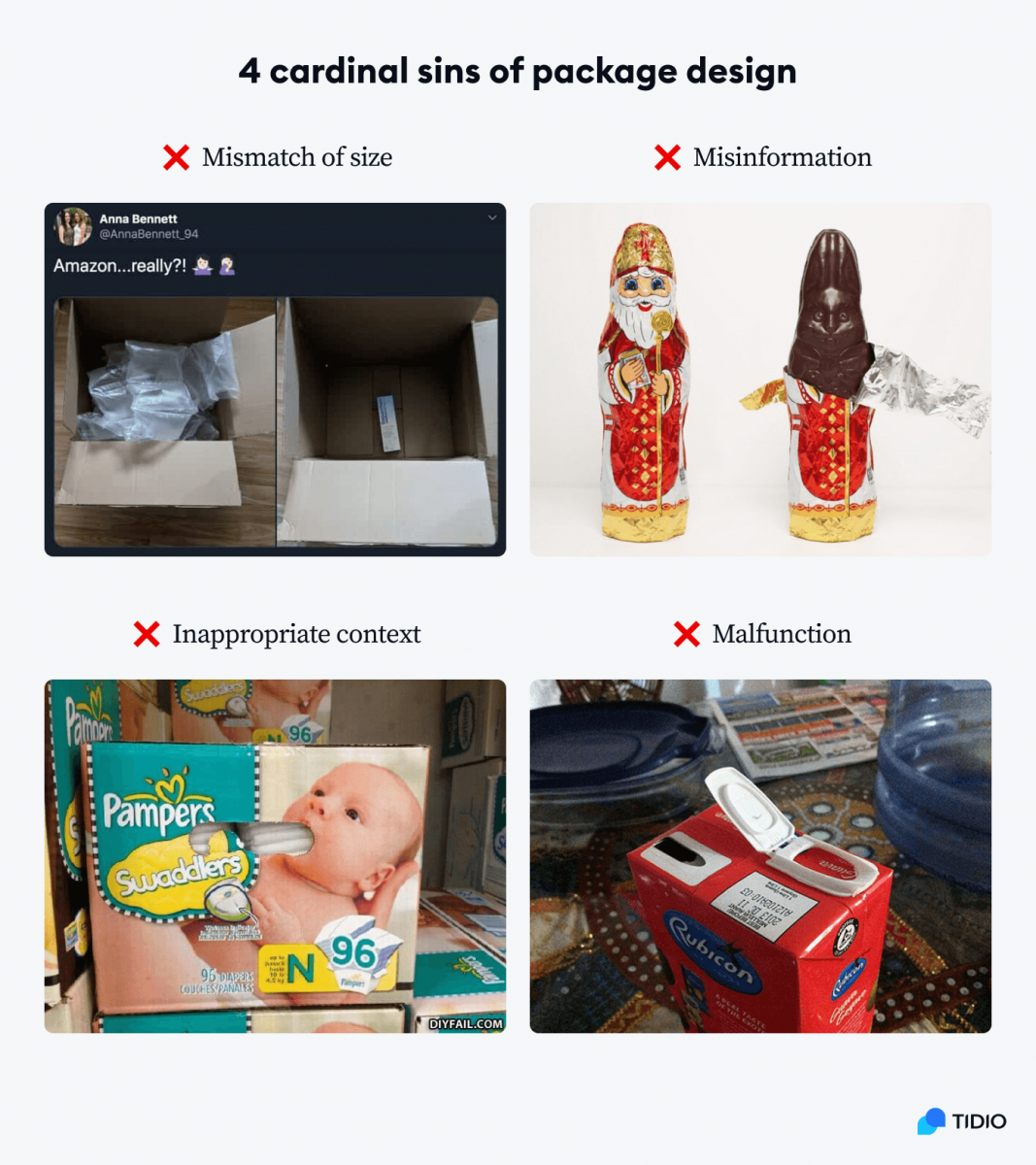
- Mismatch of size. Packaging that is too big or too small.
- Misinformation. Misleading labels or designs.
- Inappropriate context. Design elements don’t work together.
- Malfunction. Projects are impractical or difficult to use.
Key takeaway
Good design is essential for the success of your product on the market. Some designers’ fees may seem astronomical, but their creations might be decisive for the fate of your project.
You should make sure that your design ideas are:
- Aligned with your brand
- Practical
- Cost-effective
- Eye-catching
- Sustainable
Proper packaging is not only handy and informative. It can also be memorable and make a positive first impression. It is important not to blow this chance.
Find out how to use AI-assisted service to boost customer satisfaction

